
In my experience… the category page is the most “after thought” page on an eCommerce website, especially when it comes to SEO.
While most eCommerce site owners obsess about optimising their home and product pages, they often miss out on a major opportunity by neglecting the category page.
Category pages, when properly optimised, have huge potential to attract high-intent traffic.
People who are actively looking to buy.
Neglecting them means leaving valuable traffic (and revenue) on the table.
That’s why in this article I’m going to reveal how to master SEO for eCommerce category pages.
But before we dive in, let’s break down why category pages have such a big potential to drive organic traffic when SEO is done right.
Why Category Pages Are An Important Piece To A Successful SEO Campaign
The main reason why category pages have such a big potential for dramatic traffic boosts when SEO is done right is because they target a broader market that is searching.
People that land on category pages usually know what they are after, but unsure which product is right for them.
It’s people that are in the consideration stage of the customer journey.
They aren’t ready to make a decision, they still need more information before making a decision.
Which from our experience means there are a lot more people making these searches than people looking for the actual product.
Let me give you a real life example.
A client of ours sells plants.
Looking at the below screenshots of traffic numbers for the last 16 months it shows there were a lot more people searching for what the client sells on a category level than on a product level.
The category page for “hedging plants” received 21, 317 searches.
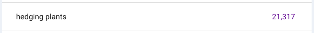
While the product page for a specific type of hedging plant called gardenia received just under half of that coming in at 11,940.

What we have found is that this trend is the same across a lot of industries we run SEO campaigns for.
Our hot water system client receives dramatically more traffic for “hot water system” than they do for “rinnai hot water system”.
Our outdoor lighting clients eCommerce website’s category page receives 97.39% more traffic than the specific product pages within the Festoon Lighting category.
The reason for this is that the market that’s in decision mode, but unaware of specific products available is always going to be bigger.
And not tapping into this market with a category page will put your SEO campaign at a disadvantage.
So here are 8 best practices we follow for ecommerce category pages that help our clients rank for broader traffic like this.
1. Choose A Page Layout That Draws Attention To The Categories Available In The Store
Page layout is the way of arranging and presenting information to the user.
A good layout is designed to draw attention to the most important parts.
People don’t read text.. they skim the text.
According to Nielsen Norman Group, 79% of users only scan the page or screen.
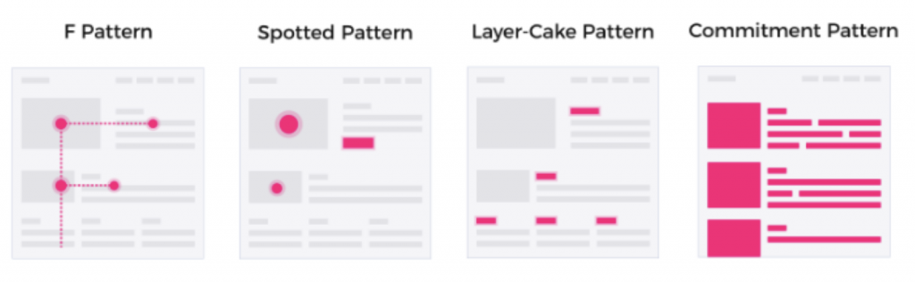
The above are the 4 types of Eye Tracking patterns.
Without delving too much into the science of it, we will give you the key takeaways:
- Organise your page layout in a visual hierarchy
- Prompt curiosity
- Use visuals to create interest
- Keep your important content like shipping info, money-back guarantee on the LEFT
- Create cues to direct users
- Use white space to improve readability and eye flow.
According to Hubspot, 55% of your visitors spend less than 15 seconds on your website.
With our attention span dwindling, that doesn’t seem too crazy. So when you have only 15 seconds to make an impression, creating a good layout is the way to go!
Example of a poor page layout
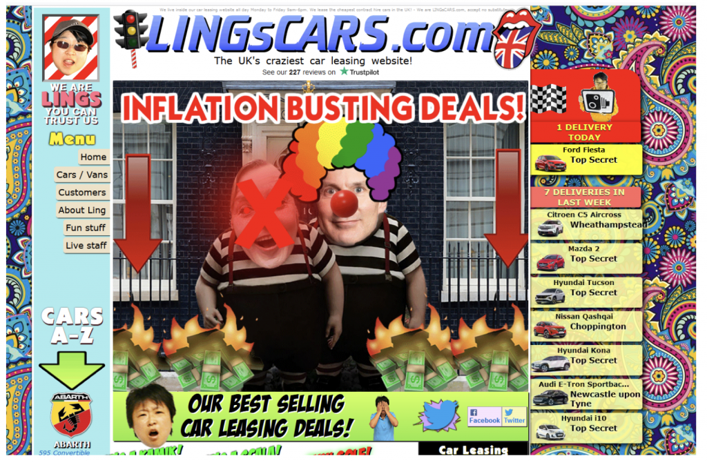
Source: LingsCars.com
Example of a good page layout
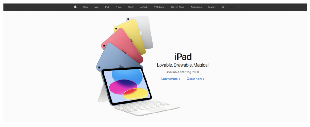
Source: Apple
2. Create A User Friendly Navigation Menu
The header section of the website typically includes:
- Navigation menu with different categories and subcategories
- Search bar
- Cart button
The navigation bar helps users orient themselves on the website. And they can locate what they are looking for. It improves the stickiness and users are more likely to stay engaged when they visit the site.
A navigation bar can be of two types: Horizontal and Vertical
Horizontal navigation
It is the most common type of navigation and lists the common categories side-by-side.
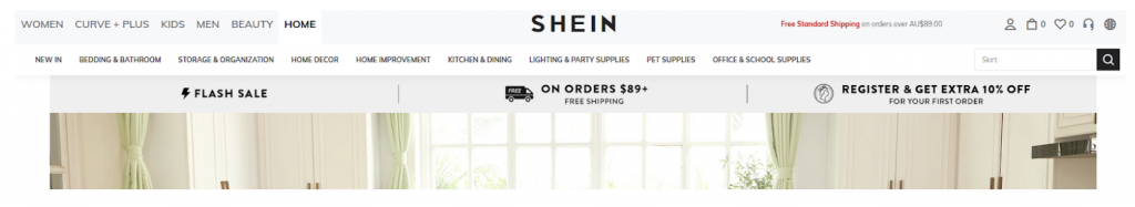
For example - this is a link from Shein. They also use a dropdown navigation menu to include subcategories. This tactic makes the UI clutter-free.
Vertical Navigation
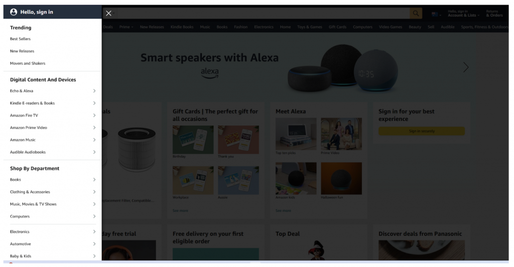
Source: Amazon
eCommerce giant, Amazon uses vertical navigation. The navigation is tucked away neatly until you click on it.
There’s no consensus on the best type of navigation bar. You can use the one which best suits your website. Users are more familiar with horizontal nav bars and it feels more natural.
Use vertical navigation if:
- You want to include several menu items
- If you would like to make your website responsive on all types of devices
- If you frequently add new pages or change menu names
- If you want the flexibility to scale and alter the menu
- You have a complex collection of products
- The length of link names varies
- If you want to do something different
Use horizontal navigation if:
- You want to use dropdown navigation to show subcategories
- You want to make navigation clearly visible
- You want the users to scan from left to right
Breadcrumb navigation - it tells the users which page they are on and helps them jump to different content based on their preference
It is a great way to improve ranking and keep your users engaged.
Example of breadcrumb navigation :
- Home > Category > Product
- Home > Category > Subcategory > Product
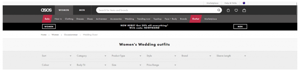
This example from Asos shows Breadcrumb navigation which is:
Home > Women > Occasionwear > Wedding Guest
3. Use Colours To Match Your Brand And Market Preference
“The subject of colour seems to have almost endless ramifications
and to touch upon life in almost every quarter, for colour is rich in lore,
rich in meaning and purpose.”
– Faber Birren
You may already know different colours evoke different emotions.
There are feminine colours and masculine colours. And the colours you use on your website really matter! Use colours strategically to evoke emotions and the industry you are in.
For example:
Black denotes strength, authority and elegance. It is commonly used for high-end products like Luxury cars
White denotes perfection, innocence, cleanliness and faith.
Red represents passion, love, leadership and courage.
Blue represents professionalism, trust, calm and stability.
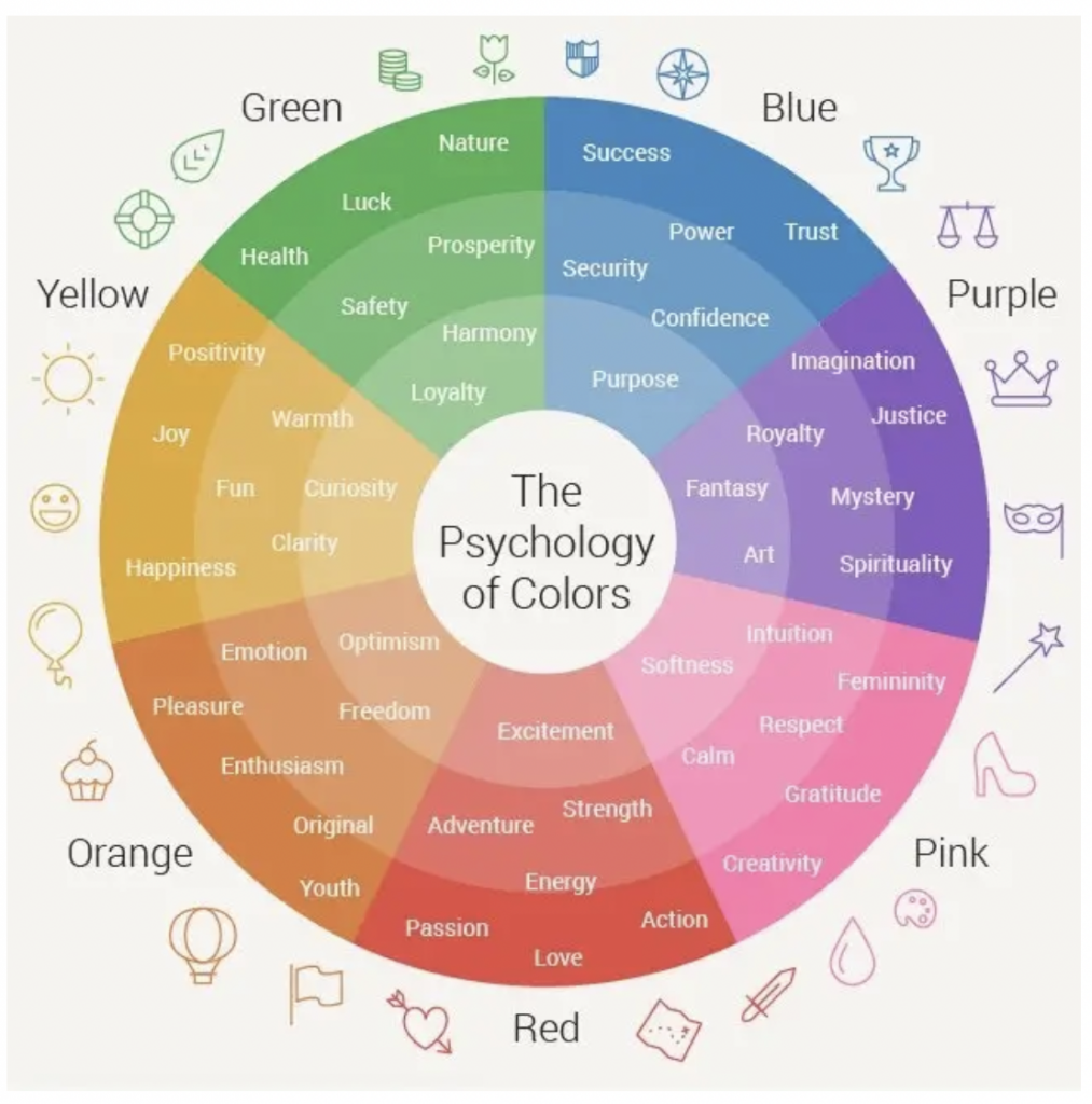
Source: Wordstream
With more understanding of this topic, you can use colours to improve your marketing efforts.
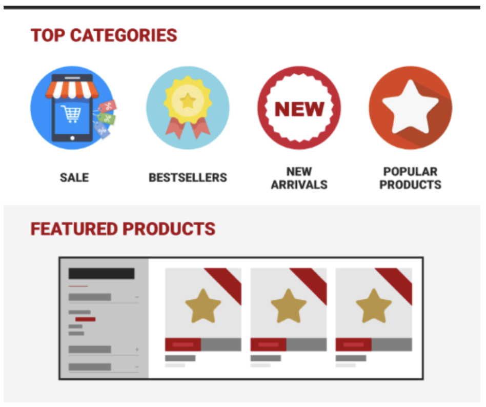
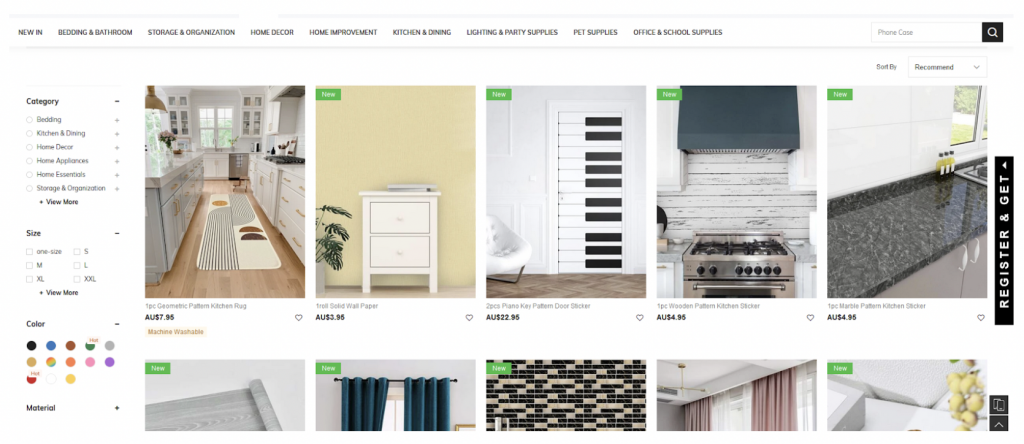
4. Utilise “Top Categories” For Easier Browsing
Using top categories segmented by popular products, bestsellers, new arrivals and products on sale is another way to improve conversions.
You can use bestsellers from different categories to pique customers’ interest. Or you could use related categories within easy reach for the user.
Source: Transcosmos
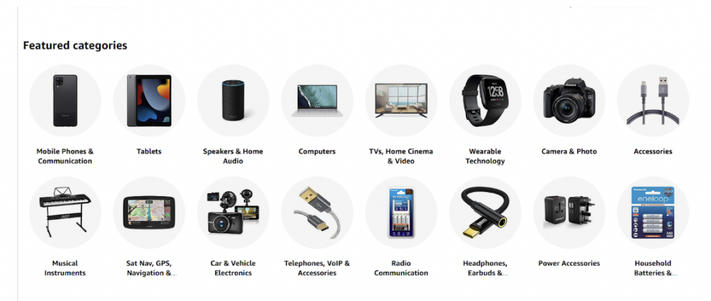
Source: Amazon
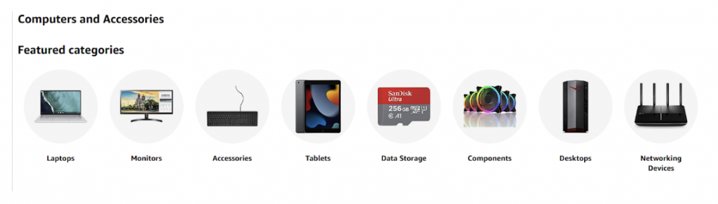
Source: Amazon
In the above two examples, Amazon has strategically placed Featured Categories to make sure the users find information easily.
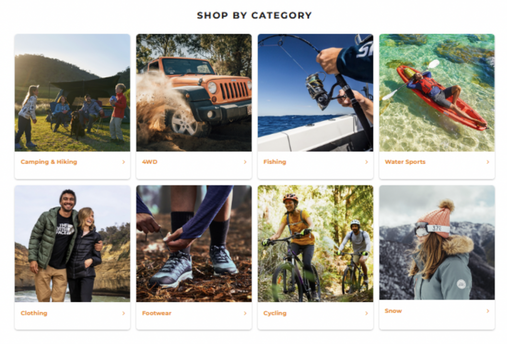
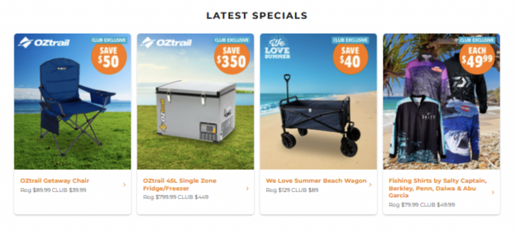
Source: Anaconda
Anaconda does this well too. They offer an option to “Shop by Category” and showcase the latest specials just below this link.
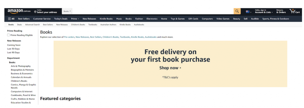
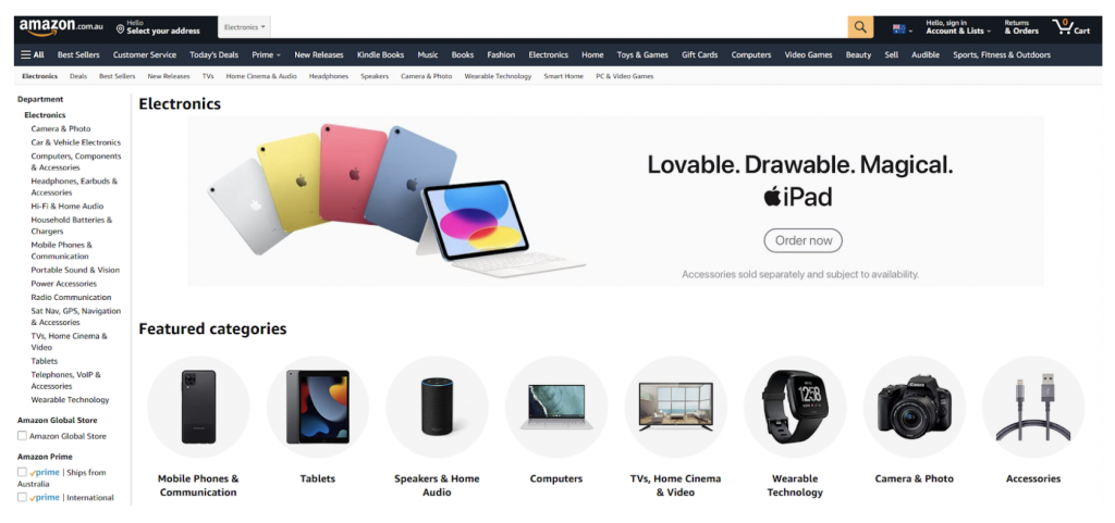
5. Use Feature Banners To Highlight A Limited-Time Promotion
The main purpose of feature banners is to highlight a limited-time promo or sale.
It conveys a value proposition to the user, provides a CTA button and adds a visual appeal. It works for promoting special offers and discounts.
For example, these two pictures from Amazon, show feature banners in the categories of Books and Electronics.
Their placement above the fold draws attention and piques interest.
6. Use Images To Visually Represent Categories
Add images for different categories and assign equal weight to all images to create uniformity. The below example uses good-quality images for all categories. They are all of the uniform weight and create a sense that they all have the same importance.
Source: Anaconda
Things to consider:
- Ensure your images are high-quality
- Don’t use stock images
- Ensure the images are optimised - use webp format to save space
- If you are using WordPress, you can use Imagify or Smush
- Alternatively, you can convert images to webp directly using cloudconvert or Convertio
- Shopify automatically serves webp images since 2019 for all files uploaded in JPG or PNG format.
- When you save an image, use a descriptive name to store the image rather than random titles like pic1.webp
- Use alt tag to describe the image - it helps improve the accessibility for users and describes the pictures if the image doesn’t load
- Use lazy loading to improve the page load times
7. Use Content To Answer Shoppers Questions
Your content can clarify any doubts your customers can have.
The description for your category pages needs to be relevant. It should explain the product and clarify any doubts the customers might have.
For category names like Electronics, Books, or Clothing, it is self-descriptive and easy to understand
But if you offer something your customers may not be aware of, write additional content that can educate your customers.
- Include keywords related to the category page
- Use creative headlines, subheadings and paragraphs explaining the category
- Focus on the benefits that the category offers
Bonus tip:
Include these options for more conversions
- Filters - a filtering option helps buyers sort products on the basis of size, brand, specs and more
- Product recommendations - Include relevant products to help customers discover more products
- Reviews and rating - Social proof is a great way to build trust and sway the buyer in your favour. Include reviews and ratings to ensure your customer deepens their search
- Wishlist - Introduce a “Add to Wishlist” option on your category pages to make them come back again and again to your website.
Here Shein offers customers an ability to filter on the basis of category, size, colour, material and more.
The “heart” icon below products offers customers to add products in their wishlist.
Recently viewed or Browsing related personalisation - This delivers products based on the customer’s interest. It delivers targeted information and improves user engagement.
8. Use The Right Typography That’s Easy To Read & Relate To
Like colour, typography is important to communicate your message. It creates a sense of balance on the website between the content and graphics.
It improves legibility and makes the website aesthetically pleasing.
Typography has different elements like:
- Typeface - Serif, Sans-Serif and Decorative
- Font
- Baseline
- Kerning
- Ascender
- Tail
- Tracking
- Alignment
- Hierarchy
Without delving too much into detail, we will summarise how to focus on this:
- To create balance, use only 1-2 typefaces on your website
- Sans-serif fonts are more readable - for content that you want the user to focus on content, use sans-serif font
- Stick to standard fonts like Montserrat, Helvetica, Verdana or Tahoma
- Use font size appropriately
- Avoid caps
- Create a visual hierarchy by using headings, subheadings and paragraphs
- Avoid using fancy fonts, and animations as they will impact readability
- Test your website on different devices to see if your content is readable
- Conduct user testing - it doesn’t need to be fancy. You can seek help from your friends, neighbours or family. They can offer you insight into the readability of the text.
- Use contrast carefully to maintain readability. You can use coolors to analyse the contrast ratio between font and background colour.
Note:
According to Web Content Accessibility Guidelines, there should be a ratio of at least 4.5:1 for normal text, and 3:1 for large, bolded text
- Use whitespace to promote legibility
- Use bold and italics to emphasise particular words
So where to from here?
If you're looking for a SEO provider to help you with your store, have a look at our eCommerce SEO Services outline here.
If you like what you see and how we work with clients then we'd be happy to get together for a bit of a chat and discuss your project, opportunity and the current state of your site.
The best way to get in touch is to request a free quote, speak to one of our eCommerce Specialists and map out a plan for your store.
Do You Still Want To Learn More?
If you made it this far, you are a rockstar!
There is a lot to unpack and process here.
Take a deep breath .. relax and implement these changes.
Hopefully, it will help you make changes to your category pages that will boost your revenue!
But if you're still confused what a category page is you can learn more about category pages at the links below.