
In today's fast-paced digital landscape, accommodating the needs and expectations of your target audience is more important than ever.
Australian businesses of all sizes are learning to adapt their robust website content to screen sizes no bigger than the size of your thumb. It's called responsive web design. If you haven't heard of it, then your business website may already be losing traffic.
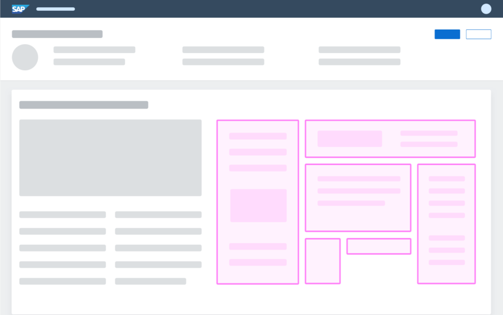
Responsive web design is when websites are built to look good and work well on a range of devices. Your website's content needs to adapt to all different screen sizes, including desktop computers, smartphones, and tablets. This adaptability allows users to easily navigate and view your website regardless of the device they're using.
Good, responsive website design is flexible and fluid. Changes in layout, text, columns and images, and orientation will happen seamlessly without the user noticing.
Ready to learn more about responsive website design and why your business needs it?
Keep reading!
Does My Companies Website Need To Be Responsive?
Having a responsive website provides a better experience for the user by making content more accessible.
A responsive website changes the layout of content to suit the device it's being displayed on. For example, a website viewed on a smartphone has different dimensions than when it's viewed on a different screen size of a tablet or desktop.
If your website isn't responsive, mobile users won't bother looking at it because they won't be able to view it properly and you'll lose a large amount of traffic.
A responsive website looks good on all devices, from small smartphone screens to large computer monitors.
If your website isn't responsive, it may be useless to more than half of your target audience.
Not only will people stop clicking on your site, it won't even appear on search engines.
Google prioritises mobile page load speed as a key factor when determining how to rank your website. And it's most likely that the majority of your organic search traffic is coming from Google.
So yes, your website needs to be responsive. And preferably mobile first. (Read on to find out what this means).
If you're working with a trustworthy web design agency, they will factor in responsiveness to the cost of your website.
Why Every Aussie Business Needs a Responsive Website in 2024
Australia holds the eleventh largest e-commerce market in the world.
With online revenue expected to reach US$32.3 billion by 2024, it's clear that smartphones play a significant role in propelling e-commerce forward.
In fact, nearly 95% of Australians say they never leave home without their smartphones, highlighting the extent of their dependency on these devices.
If Australians need to find goods or services, they often turn to their mobile phones for help. And if your website isn't optimised for mobile with a responsive design, you're missing out on a massive percentage of all that traffic to your eCommerce site.

Benefits of Responsive Web Design
- Seamless User-Experience
- Enhanced Brand Representation
- Improved Search Engine Results
- Reduced Bounce Rate
- Increased Local Search Rankings
- Higher Conversion Rates and Sales
- Faster Website Performance
How does responsive web design work?
Responsive web design uses fluid grids, layouts, breakpoints, HTML, and CSS media queries to automatically accommodate resolution, image size and scripting.
If you're using a website builder like Wix or Squarespace, responsive design options are built into their platforms. However, if you have a custom-made WordPress website, creating a responsive web design may require the help of a skilled web developer.
Is responsive web design the same as mobile-first or adaptive design?
Before tablets and mobile phones, web pages had a static design with a fixed size. But once more people began to use the internet using these different devices, web pages no longer fit the viewport, the user's visible area of a web page.
So, in recognition of the fact that the majority of people now view the internet primarily on their mobile phones, our thinking has now changed to give users the best experience possible.
Responsive vs mobile-first design
TL;DR: A mobile-first design is responsive, but not all responsive designs are mobile-first.
Responsive web design refers to creating websites that adapt and respond to different screen sizes and devices. It involves designing and coding a website in a way that allows it to fluidly adjust its layout, images, and content to provide an optimal viewing experience across various devices, including desktop computers, smartphones, and tablets.
Mobile-first design is a specific approach where the website is initially designed and optimised for mobile devices. The focus is on creating a seamless and user-friendly experience specifically tailored for smaller screens.
Mobile-first design prioritises the needs and constraints of mobile users, and then expands the design to accommodate larger screens. That's because it's easier to make a small amount of content fit on a big screen. It's much harder to fit a large amount of content on a small screen.
Adaptive design, also known as adaptive web design, involves creating different versions of a website specifically for different devices or screen sizes.
Instead of fluidly adjusting elements, adaptive design relies on pre-determined layouts and designs for specific devices. The website detects the device being used and delivers the corresponding version that is best suited for that device.
7 Best Practices for Creating a Responsive Website
Responsive web design is all about accessibility, so it doesn't make sense to design your website for desktop devices if the majority of your clients will never view it that way.
Here are some of the basics you need to get your Aussie business in front of mobile users.
1. Prioritise Mobile-First Design
As you've read above, optimising your web page for mobile devices needs to be a priority due to the number of visitors who will be coming to your site using a mobile device.
By simplifying the elements of your web page, visitors can find what they need quickly by scanning your site.
Having a single-column design with appropriate font sizes, easy-to-view typography and a smaller number of images is better for a user and will have them scrolling your site for longer.
2. Optimise Content for Smaller Screens
Content should be optimised for smaller screens by making use of a larger font size, more prominent buttons and fewer words and features.
Because the browser window is so small on a mobile device, websites need to have buttons that are large enough to tap without the user having to zoom in.
It's also important to have enough space between features such as icons and hyperlinks so that users don't accidentally click the wrong button. Optimal spacing between buttons is between 12-48 pixels.
And while it may seem obvious, it's crucial to use a font size that's large enough for text to be seen clearly but so it also fits the browser width comfortably.

3. Create Responsive Images and Videos
A responsive image, video, picture or illustration will resize automatically according to the screen size when it's being viewed on different device widths.
To do this, developers often use the max-width property, which defines the maximum width for an element. The height of the image will then auto-adjust.
Using responsive images avoids unnecessarily downloading bytes of data, therefore improving your site's load time and increasing its performance and improving the user experience.
4. Utilise Flexible Page Layouts
Another aspect of responsive web design that will help improve the user experience, is the use of a flexible layouts based on a grid. Flexible page layouts help the website adjust to different screen sizes while giving you more control over the layout of your pages.
With a fluid layout, size specification is performed not in pixels but in percentages, so a screen size change means the proportion of the attributes stays the same. This means you can easily create and resize multiple columns and stack or reorder sections.
5. Designing for Touchscreens
From tablets to smartphones, the majority of the devices people use to view websites are touch-enabled.
As mentioned above, size and spacing are key. Having larger target areas for fingers to click on important buttons and links is crucial to a great user experience.
6. Test Your Responsive Designs
Web developers need to make sites appealing to the broadest range of users and browser testing is the only way to ensure the quality of your website on different screens.
From Firefox to Chrome, Edge and Internet Explorer to Android and Apple, testing screen resolution, readability and functionality across a variety of platforms is crucial to an enjoyable user experience.
Visitors will steer away from sites that don't work on their chosen browser rather than change the ways they prefer to view sites.
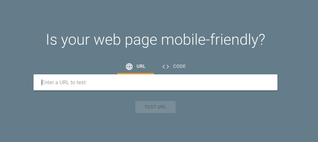
If your site isn't ranking well, try using Google’s mobile-friendly test tool as a starting point.
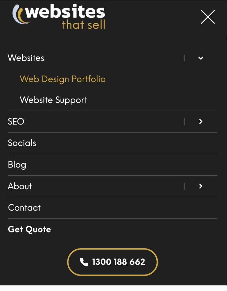
7. Include a Hamburger Menu
A hamburger button is where you'll normally find a site's menu on a mobile-friendly site. It's named so because the icon features three horizontal lines resembling a meat patty between a bun.
On desktop screens there is ample room for an extensive menu. But that's not the case on mobile devices.
Mobile-friendly website design requires a simple menu that gives an overview of your site. A search feature is an advantage here, to help a user find what they're looking for if they can't locate it on the menu. And make sure your contact details are also front and centre.
Quick Tips to Improve Your Website's Responsiveness
Just starting to look into responsive web design? Here are a few tips for your unique business type. Or, if you're in the process of hiring a new web design agency to improve your website responsiveness, you can use these tips to start the conversation.
E-commerce businesses
- Make sure your navigation is easy to use
- Optimise product images so they display properly on different devices
- Ensure the checkout process is streamlined and easy to use
- Test the website on different devices to make sure the payment process works flawlessly
- Incorporate a search bar so customers can find what they are looking for quickly
- Design for touchscreens, including larger target areas for buttons and links
Service-based businesses
- Make sure the contact information is prominently displayed.
- Provide an easy way for customers to book appointments or schedule consultations.
- Make sure the website is optimised for search engine rankings.
- Include customer reviews and testimonials to help build trust.
- Display portfolio images and other information to showcase your services.
- Test the website on different devices and browsers to make sure it is working properly.
Don't have time to figure it out yourself?
Hire a web design company to do it for you.
Websites That Sell do more than just design websites. They can help you get meaningful results by turning visitors into sales - view our web design page.
Contact us on 1300 188 662 to speak with us about building your website to be as customer-friendly as possible. Or, get your free quote today!