
Your website looks great: modern, clean, and professional. But the phone isn't ringing, the contact form sits empty, and that competitor with the ugly site? They're booked out three weeks in advance.
This happens more than you probably think. Business owners invest thousands into a website that looks the part but doesn't actually do its job. The design ticks every aesthetic box, and the branding is on point, but none of it converts because the fundamentals were never there to begin with.
A visually appealing website that doesn't generate leads is just an expensive brochure.
The web design principles that actually matter have nothing to do with trends. They're about how people use your site, how fast it loads, and whether it makes it easy for someone to take the next step.
We've built websites for businesses across Brisbane, the Gold Coast, and the Sunshine Coast for years. We've seen what works and what doesn't, and the patterns are clear. The sites that perform well follow a set of design principles that put the user first, not the business owner's personal taste.
This is what those principles look like in practice.
What Makes a Website Design Actually Work for Your Business
A well-designed website follows a set of core design principles that prioritise the user experience above everything else. Good web design means:
- Your site loads fast
- Works properly on mobile devices
- Has a clear visual hierarchy, so visitors know where to look
- Uses white space to keep things readable
- Makes website navigation simple
- Places call-to-action buttons where people actually see them
- Keeps the overall design consistent with your brand identity
These web design principles aren't about chasing trends or making things look pretty for the sake of it. They're about making sure your website does what it's supposed to do: getting visitors to take the next step and become customers.
In our experience across more than 563 digital marketing campaigns, the websites that convert best aren't always the ones that win design awards. They're the ones that make it easy for people to find what they need, trust the business, and take action. Every design element on the page earns its place by supporting that goal.
Clear Purpose and Visual Hierarchy

When someone lands on your website, they should be able to tell what you do, where you do it, and who you do it for within seconds, without scrolling or clicking through a menu.
The headline above the fold is the most important element on any web page, and the biggest mistake we see is business owners trying to get clever with it.
Say you're looking for someone to fix your air conditioner. You click the first result in Google and land on a company that does plumbing, air conditioning, and general maintenance. But their homepage has a photo of a waterslide, and the headline reads "Make a Splash." They probably offer exactly what you need, and they might even be great at it, but nothing on that page told you that. So you hit back and click the next result. The fix is simple. If you're a plumber in Sydney, say you're a plumber in Sydney. You can add personality with a tagline underneath if you want, but the main headline should tell people what you do and where you do it, and it should be as short as possible.
A good test is to put your website in front of someone and ask them what the business does. If they can't tell you within a couple of seconds, it needs work. That applies whether you're building a new site or reviewing an existing one.
Visual hierarchy is just how you arrange things on a page so people see the important stuff first. Bigger text is read first, high-contrast colours make key information stand out, and smart placement of headings and images guide attention down the page in a way that feels natural.
Most people scan web pages in an F-pattern, reading across the top and then scanning down the left side, looking for subheadings or anything that catches their eye. Your layout should work with that, not against it. Use size, colour, contrast, and spacing to lead people to your key messages without them having to think about it.
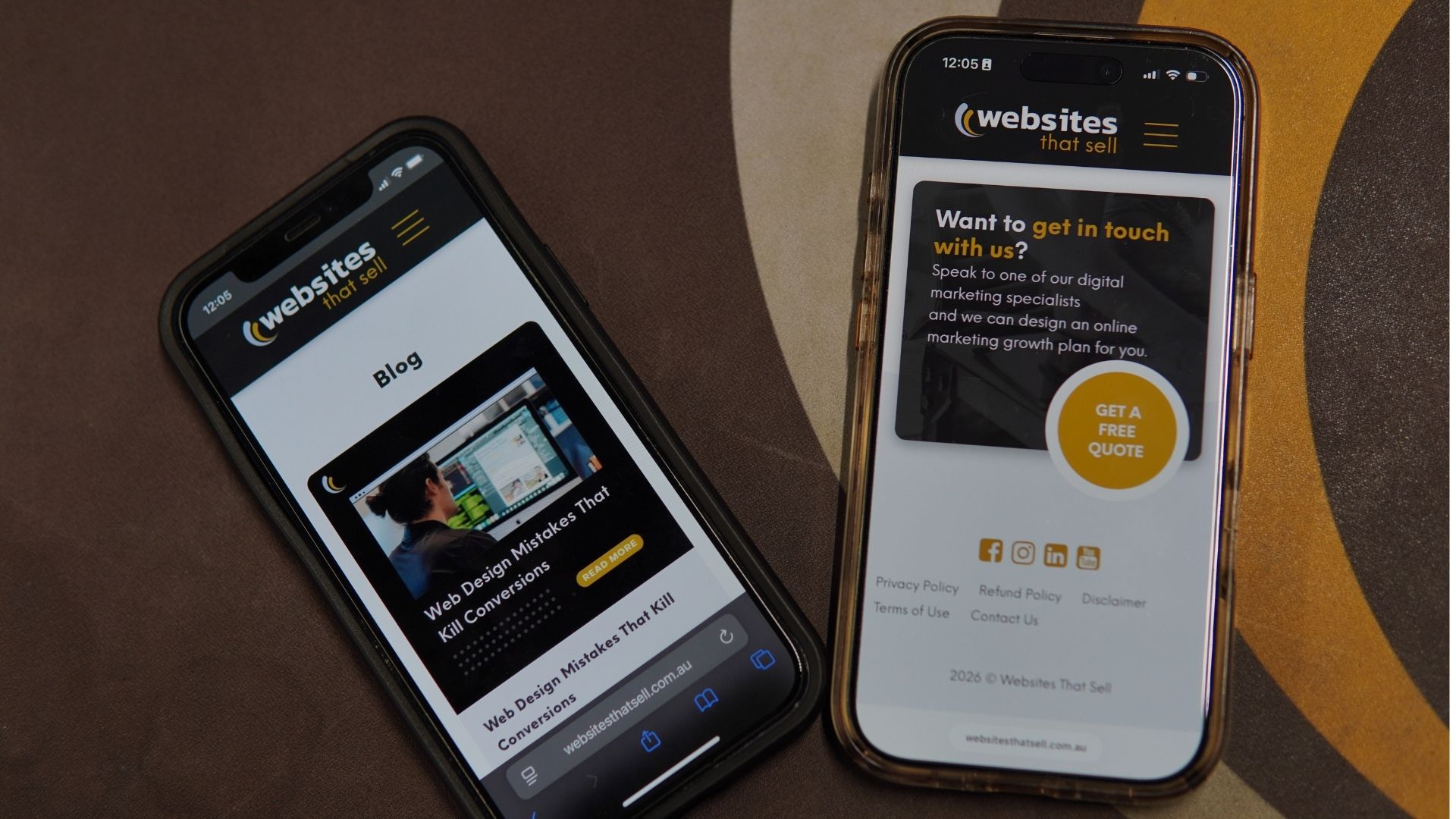
Mobile-First Website Design Is the Baseline
Over 60% of web traffic now comes from mobile devices. Google uses mobile-first indexing, which means it ranks your website based on how it performs on mobile devices, not desktops. This isn't a nice-to-have; it's the baseline for any serious web design project.
For most local businesses, service businesses, and trade businesses, a mobile-first approach is the right call. That's where most people are going to find you and visit your site, and with modern web design tools, there's no reason a mobile-friendly website can't still be packed with quality information and look good doing it.
One of the things that works well in mobile-friendly web design is keeping people interacting with their devices. Swiping through image carousels, clicking through tabbed sections, or tapping to expand FAQs. As basic as it sounds, keeping fingers busy and moving through the website keeps users engaged. That's how people use their phones, especially younger audiences who've grown up with touchscreens.
Even if desktop is your primary concern, like an architect showing off a visual portfolio, the mobile design still needs to sell you. When someone searches on their phone during the train ride home from work, it needs to be good enough to make them come back on their computer later. Neither version should ever be an afterthought. A broken mobile experience costs you trust, even if barely anyone uses it.
Mobile-friendly sites also need to be fast. Even a 2-second delay in page load time can increase bounce rates by over 100%. Mobile users have almost zero tolerance for slow websites. Speed is part of creating a seamless user experience on mobile devices. Make sure buttons are thumb-friendly and at least 44x44 pixels. Keep your sign-up form and sign-up form fields simple. The fewer taps it takes to get in touch, the better your mobile user engagement will be.

Navigation That Makes Sense
There are so many websites that try to jam everything into the top menu. It doesn't need to be there.
When you overload your navigation bar with too many menu options, two things happen. First, users can skip over pages you actually want them to see. Second, they get overwhelmed and end up choosing nothing.
That second one has a name... Hick's Law. It states that the more choices you present to someone, the longer it takes them to make a decision. Give people too many options, and they won't make one at all. This is why good website navigation sticks to 5 to 7 main items.

Think about it from the customer's perspective. What journey do they need to take? The menu should have the starting points for each of those journeys, not every possible destination.
Say you're a plumbing business. Your navigation menus might have a dropdown for services, one for emergency services, and a couple of other key pages like About and Contact. From there, each service page handles the details and links to related services. You're creating that journey from the pages themselves, not trying to cram it all into the navigation bar.
This makes your website more user-friendly because visitors learn the structure quickly. It also helps search engines understand how your site is organised, which supports your SEO. The goal is to make every step feel intuitive. If someone has to think about where to click next, the navigation needs work. Good web design makes the path from landing on your website to contacting you feel effortless, keeping users engaged and moving toward conversion.
Strategic Call to Action Placement
There's no single formula for where to place your call-to-action buttons. It depends on the page's structure, the type of business, and the information flow you've created.
Whenever you finish answering a question or delivering something useful, put a call to action right there. That might be all someone came to your site for. They had one question, you answered it, and now they're ready to get in touch. Make it easy for them.

In the first section of your home page, you've got a short overview of the business and what makes you different, followed by a call to action. Then you go into more detail about your services, followed by another call to action. Then include case studies or testimonials, followed by another call to action.
The idea is that different visitors are at different stages. Some are ready to act after reading your headline. Others need to scroll through the entire page before they're convinced. Strategically placing call-to-action buttons at each decision point means you're catching people wherever they're ready to convert.
For service-based businesses, your header should have a sticky phone number and a "Get a Free Quote" or "Book a Consult" button that follows visitors as they scroll. If someone's made up their mind halfway down the page, you don't want them having to scroll back to the top to find your number. Make it easy to contact you at every point.
Using high-contrast brand colours for your call-to-action buttons helps them stand out from the rest of the page. Your button styles should be consistent across all landing pages so visitors always know what to click. And keep the text specific. "Get a Free Quote" works better than "Submit" because it tells people exactly what they're getting.
Strategic placement of call-to-action buttons can convert visitors who would otherwise leave without doing anything. It's one of the simplest web design principles to implement, and one of the most effective at improving results.
White Space Is Not Wasted Space
Blank space on a website isn't something to be scared of. But too much can look like something's broken.
White space is the empty space between design elements on a page, and it's one of those things that makes a bigger difference than most people realise. It gives your content room to breathe, makes large amounts of information easier to get through, and helps the important stuff stand out.

The key is pacing. Break information into smaller sections with enough white space around them so nothing feels overwhelming. But don't fill negative space just because it's there. If you've got a good image that adds value, put it in. But if you're cramming in a photo just to fill a gap, it's going to look like a school-age collage rather than a professional website design.
A good rule of thumb is that everything should look intentional. If there's a stretch of blank space and it feels like an accident, it probably needs attention. But when white space is used deliberately, it creates a clean layout that feels visually appealing and easy to use.
White space also supports your visual hierarchy. It keeps important visual elements highlighted by giving them room to stand out. When everything is crammed together, nothing gets noticed. Proper spacing is especially important on mobile devices, where small screens mean less room for each section. Negative space is what keeps a mobile-friendly website from feeling cluttered.
Page Speed Matters More Than You Think
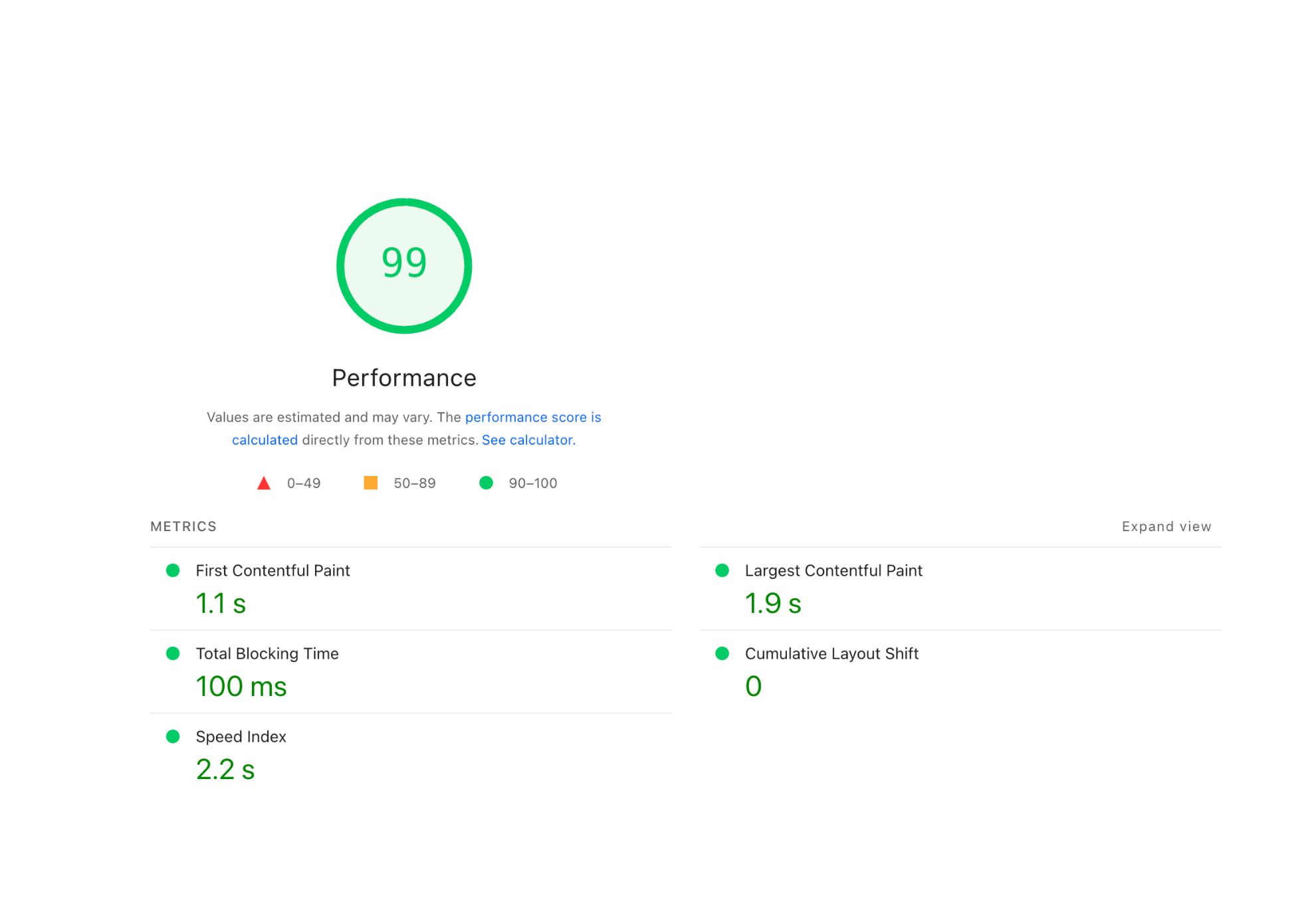
If your website hasn't loaded, nobody is going to see your well-crafted headline. They're not going to read your copy or see your services. They're just going to leave.
The time we have to grab someone's attention keeps shrinking. The most recent data puts it at around 2.5 to 3 seconds. If your web page hasn't loaded within that time, visitors will hit the back button and go to the next search result. You'd probably be surprised by how many people visit your website and leave before it even finishes loading.
You want your site to be fast enough that by the time it loads, people are already reading that headline we talked about earlier. Within three seconds, the page loads, they read the headline, and they know they're in the right place.
And it's not just the home page. Every web page needs to load quickly. We've all used a website where the first page loads quickly, but every subsequent page loads slower and slower. That's not the user experience you want for your customers.
Google also uses load time as a ranking factor, so that a slow site can hold you back in search results. It comes down to the basics: optimised images, lean code, and good hosting. Most websites still get at least one of these wrong. If you want to see where yours sits, Google's PageSpeed Insights is free and will tell you exactly what needs fixing.
Design Consistency Builds Trust
When your fonts change from page to page, your colour schemes shift, and your button styles look different on every landing page, it creates a disjointed user experience. Visitors might not articulate what feels off, but they'll sense it. And that erodes trust.
Consistency in website design means using the same fonts, brand colours, colour schemes, button styles, and layouts across every page. It creates a cohesive experience that feels professional and easy to use. When people learn that your call-to-action buttons are always a certain colour and always in a certain spot, they navigate faster.
This ties back to brand identity. Your website should feel like your business, which means the visual elements, tone, and colour scheme all need to align with your brand. One of the best investments you can make early in the web design process is a style guide that outlines everything, keeping everything consistent as your site grows.
A well-designed website doesn't just look consistent on the surface. The spacing, heading formats, and imagery all follow the same patterns. These design elements working together create a site design that feels intentional. That's what separates a good website from many websites that look like three different people built them on three different days.
Website Security and Your Business Credibility
Website security directly affects how website visitors perceive your business.
Something as simple as an SSL certificate can make or break a first impression. We've all been to a website where the browser pops up with a warning saying the site isn't safe. The site might be perfectly fine, the SSL just lapsed, but the visitor doesn't know that. And unless they already know and trust your business, they're going straight back to the search results. Some people won't even call the phone number on the site after seeing that warning.
Beyond SSL, be careful with who has access to your website backend. We've taken over sites with 12 admin users, and the business owner doesn't recognise half the email addresses. We've seen untrustworthy plugins and files from freelance platforms introduce malware. It doesn't have to be a full hack to hurt you. Sometimes it's just spam links being injected into your pages, pointing to things you'd never want your website associated with.
Keeping on top of it isn't complicated. Make sure your SSL certificate stays active, use strong passwords, and set up separate login credentials for anyone who needs access with only the permissions they actually need. When they no longer need access, remove it. Your web designer or agency can usually manage all of this for you, but it's worth understanding what can go wrong if it gets neglected.
The Right Amount of Information, Well-Structured
How much information should be on your product and service pages? There are two ends to this. Not enough, and people can't make a decision. Too much, and they can't find what they need.
The sweet spot is having enough information to answer the key questions your target audience will have, structured in a way that's easy to scan and find.
Your service pages should cover what the service is, what problems it solves, why you're the best choice for your target audience, and what sets you apart from competitors. Follow that with proof. Testimonials, case studies, previous projects, whatever you've got. Then back it up further with a section on frequently asked questions.
FAQs are one of the most effective ways to create a user-friendly website that answers questions for a much larger percentage of your audience. We've got clients with 30 to 40 FAQs on their service pages, broken into sections that make it easy for people to find the type of question they have. And it works incredibly well.
There's something powerful about scrolling through a web page and seeing the exact question you had in your head written right there on the screen. You click it, read the answer, and instantly feel like this business understands you. That builds trust before you've even spoken to anyone.
If customers keep asking you the same question about a particular service, add it to the website.
Match the depth of information to the service. If you're an emergency plumber, people want to know how fast you can be there, whether you charge a call-out fee, and what areas you cover. They don't need two paragraphs about how much relief they'll feel when the water stops. Keep the written content relevant to what your target audience actually needs to make a decision.
Having too much information is generally better than not enough. As long as it's well structured, flows well, and isn't just one massive wall of text. Break it into sections and chunks that make sense together so that even people who scroll quickly can find what they came for.
How to Know If Your Website Design Is Working

There's no single answer to this one. But there are practical steps you can take to get a clear picture.
Start with analytics. At a minimum, install GA4 on your website so you can track how many visitors you're getting, which pages they're visiting, how long they're spending on each page, and whether they're taking action. If your website is getting a few hundred visitors a day but the phone isn't ringing, and no enquiries are coming through, that's a pretty clear sign that something needs to change.
Beyond the numbers, get real people to use your site. Ask friends or family to visit the website and share honest feedback. Was it easy to find information? Was it easy to make contact? That kind of user experience feedback is useful early on. Just be careful of that one family member who has all the opinions but no experience in website design. Take that one with a grain of salt.
From there, start testing. Change one thing at a time. Maybe it's the colour of a button, maybe it's moving a call to action higher up the page, or maybe it's trying a differentheadline on your home page. Make the change, monitor it for two to three weeks, and see which version performs better. That's conversion rate optimisation, and it's how web designers and business owners continuously improve their website over time.
Don't fall into the trap of comparing your website to an established competitor when you've just launched. There are too many factors at play. Where your site ranks, what keywords you're targeting, and how long they've been at it. Focus on your own data and measure performance against your own benchmarks.
Even a well-designed website that's getting results can always be better. You don't know how many conversions or bookings you're leaving on the table because you haven't spent 15 minutes every couple of weeks testing a different headline or moving a button. Committing to that regularly is more than most business owners do with their websites. And it makes a real difference over time.
Why These Web Design Principles Matter for Your Business
A well-designed website isn't about winning awards; it's a tool. When these design principles work together, your site loads quickly, visitors find what they need, and they take action. When they're not, you're leaving money on the table and sending potential customers to your competitors.
Every design element on your website should serve a purpose. Visual hierarchy guides people to the right information, white space keeps things readable, and clear navigation makes the journey simple. Call-to-action buttons catch people when they're ready to act, and a mobile-friendly design meets them wherever they are. When all of that is consistent across every page, the whole site feels professional and trustworthy.
Good web design also supports the rest of your digital marketing strategy. Your SEO works better when search engines can crawl a well-structured site. Your ads perform better when the landing pages they send people to are fast, clear, and easy to use. Your content marketing works better when the website content is organised and accessible.
These web design principles aren't complicated, but they do require intention. And the businesses that get them right are the ones that turn their website into their best-performing sales tool.
Need Help Getting Your Website Design Right?

If your website isn't performing the way it should, or if you're building a new website and want to get these design principles right from the start, we can help.
We'll look at what's working, what's not, and what to fix first. No fluff. Just practical advice backed by real data from the websites and campaigns we've built.
Get a free quote or call us on 1300 188 662 to chat about your website.