
We’ve compiled 28 tested & proven conversion strategies to increase your website's conversion rate. Since 2013, we have helped & taught business owners around Australia how to increase their website conversions, and the following strategies are the result of hundreds of tests we have run to date.
In all those years, the basics to increasing a website's conversion rate has not changed, and it all comes down to basic salesmanship.
The No.1 way to increase your website's conversion rate is to figure out exactly what your visitor wants & needs and the quickest, best and easiest way to give them exactly that.
Too many "gurus" try to complicate things with 101 technical things you must do. But the basics of psychology haven't changed, therefore, neither have the basics of website conversions.
What has changed is the technology for websites to better engage visitors, and the quality of software tools to gather the data required to make conversion rate optimisation decisions.
In this guide, we've revealed our best website conversion strategies that have stood the test of time and exactly how to implement them on your website. Keep reading to find out how to take your conversion rate optimisation to the next level.
1) Interview Your Current Customers To Work Out What They Really Want
Why it matters
The biggest mistake we’ve seen business owners make over the years is never talking to their actual customers.
Instead, they trust an “award winning” digital agency to design a pretty website.
You end up with a website that might look nice, but doesn’t speak to any of the fears, frustrations, desires and benefits your customers are facing.
We’ve seen this time and time again - a website that connects with the emotions of their customers will convert better than a pretty website that doesn’t.
So how do you get this information?
How do you know what is going through your customers mind, the things they really want that you can speak to, to increase your website conversion rate?
You have to pick up the phone and start dialling.
Don’t use ChatGPT, don’t make assumptions, don’t listen to the well meaning web design agency… talk directly to your customers and ask them questions.
And what questions should you ask?
Here’s a few to get you started.
How to do it
Here are 3 of the most common questions we ask customers to understand what information we need to have on our website to connect better on an emotional level and increase conversions.
- What problem were you trying to solve when you contacted us?
- What were the biggest challenges you faced when it came to choosing a (insert what you do)
- What are the 3 top things that made you choose us in the end?
We have about 10-15 questions we go through for our clients when conducting these interviews and each question uncovers more conversion gold.
Case Study Examples
Here are some examples of websites we’ve built using this strategy to increase the conversion rate by addressing customers' emotions.
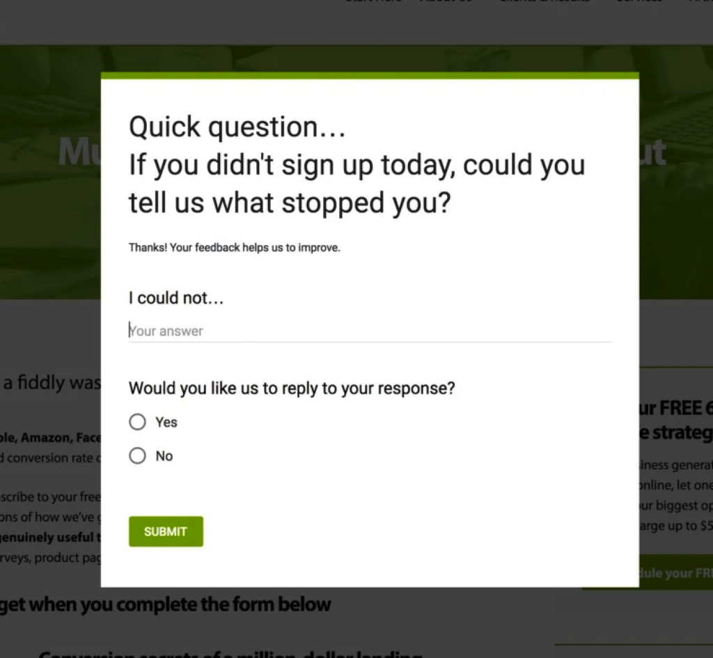
2) Survey Website Visitors To Discover What Is & Isn’t Working On Your Website
Why it matters
One of our company's core values is “we believe in proven results, no opinions.”
The quickest way to decrease conversions is implementing things on your website based on opinion, rather than proof.
Running surveys on your website gives you real-world data and proof of what’s working and isn’t working on your website.
As it provides feedback directly from website users, rather than trusting opinion -this source of data will actually help you improve the main things that real people are struggling with on your website.
How to do it
The type of survey to run really depends on what conversions you’re trying to improve.
A full website redesign will consist of totally different questions to the survey that tries to identify why people aren’t buying.
Here’s some example questions that we’ve used in surveys for different reasons:
1) Where did you find out about us?
This questions help you identify which marketing channels are working across your business.
2) What made you buy from us today?
This helps you understand the reasons someone bought and what marketing is working for your company.
3) Was there anything that frustrated you on our website?
This question helps you identify the things people are getting frustrated with on the website that you may otherwise never have found. The answers from these questions will help you dramatically improve User Experience (UX) on your website.
4) Was there anything you couldn't find on our website?
This question again helps to improve the UX on your website. Making things easy to find is one of the easiest ways to increase conversions..
Case Study Examples
Here’s examples of 3 different types of surveys and what they look like installed on a website.
Slide in Survey
Conditional Logic Survey

Pop Up Survey
3) Track Your Websites Conversion Points
Why it matters
You can’t improve what you don’t measure. So the first step to improving your conversion rate on your website is tracking your conversion points.
Conversion points are any points across the website browsing experience where a visitor has taken an action that takes them closer to the website's goal.
Examples of conversion points are:
- A purchase
- A form submission
- A phonecall
- A social media share
- A download
- Subscribing to a newsletter
- Starting a free trial
How to do it
The easiest and cheapest (it’s free!)way to set up conversion tracking is using Google’s analytics tool - GA4.
We use GA4 to literally measure anything and everything on websites we manage. If you need help setting up GA4, get in touch with us.
4) Analyse Your Current Conversion Rate & Set Goals
Why it matters
Just studying your website data gives you a good understanding of how well your website is converting.
However, once you start digging into your conversion rate data, you’ll actually be able to set a baseline of how well your website is converting and set goals for the level of increase you’re wanting to achieve.
How to do it
The main points we recommend to study as a starting point are:
- Purchases
- Form conversions
- Phone calls
Once you have an understanding of your website's conversion rate across different conversion points, you can compare this data to your traffic, the type of traffic source and make educated decisions around traffic increases or changes to the website.
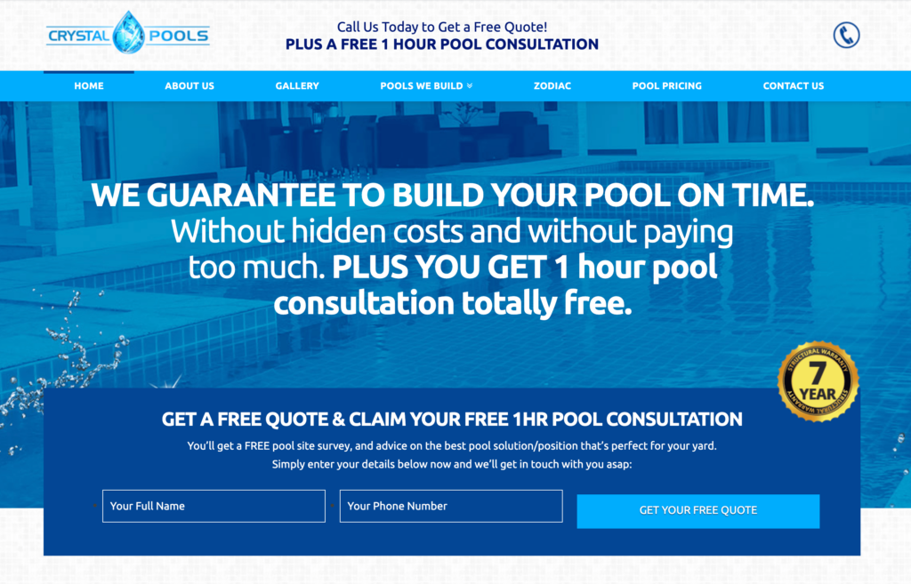
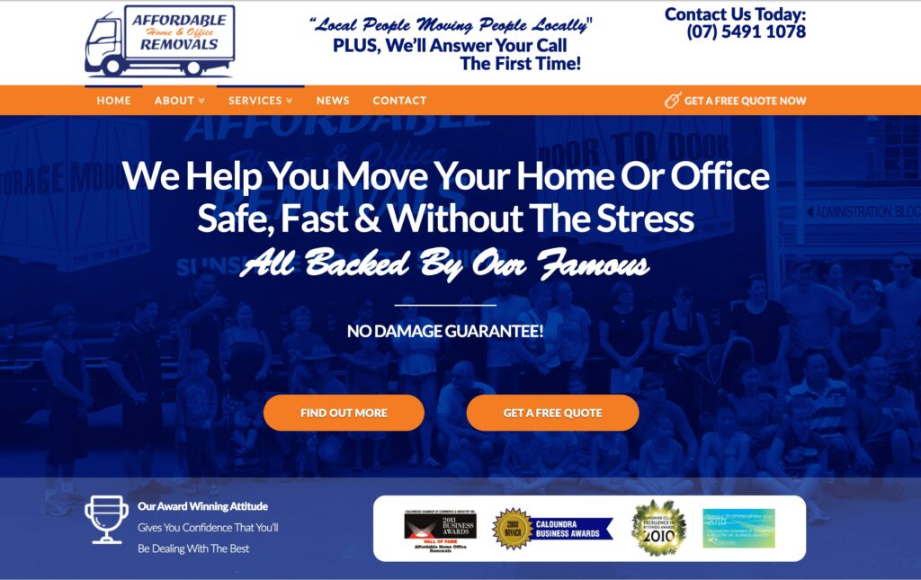
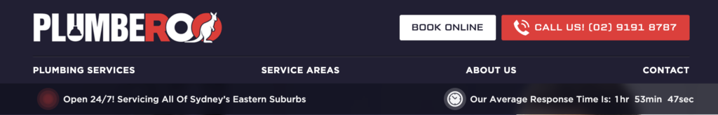
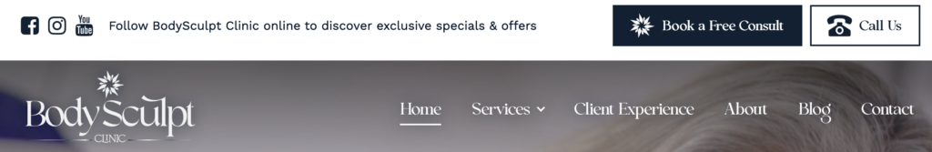
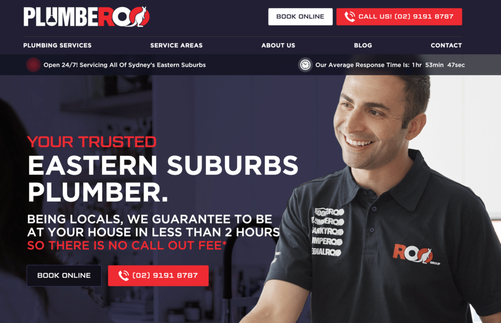
5) Build A High Converting Header
Why it matters
Your website's header is literally the first thing people see, and if you’ve implemented a sticky header, the main thing your visitors will continue to see during their browsing journey. You'd be suprised how many people miss this step and end up killing their conversions.
One of the quickest ways to improve conversions is to ensure all your most important actions and information are properly optimised on your header.
How to do it
Keep your header simple, logo small and navigation short. No more than 6 top-level menu items. Feature your primary call to action button(s). These action buttons could include:
- Phone Number
- Book A Meeting
- Request A Quote
- Visit Contact Page
- Log In
Try not to add more than 2 action buttons to the header area. They should be the primary actions you want people to take based on the website/page objective.
Case Study Examples

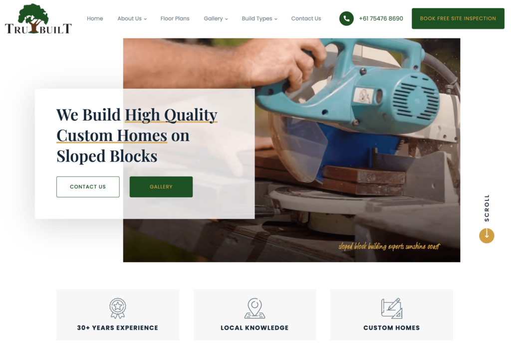
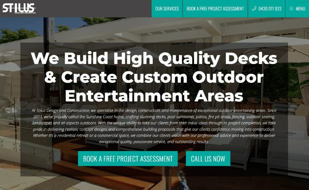
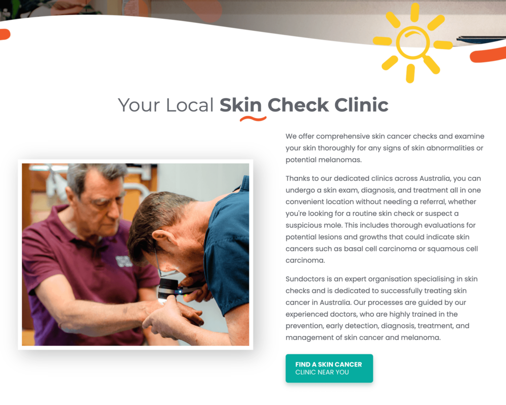
6) Make Your Value Proposition Crystal-Clear (above the fold)
Why it matters
You only have a couple of seconds to let your visitors know what you do and why they should stay on the website to learn more about your business.
Making it easy and crystal clear for people to know what your website is about has proven to increase time on site and boost conversions, and is one of the most important web design principles every business owner should follow.
How to do it
There are 3 questions your website must answer within a couple of seconds. If your website fails to do this, you need to make your value proposition clearer in order to convert more visitors.
Here are these 3 critical questions:
- What does the company do?
- Is the company able to help you solve your problem? How?
- What next steps should you take to get help from the company?
Case Study Examples
Here are 3 examples of websites that communicate the company's value proposition extremely well.

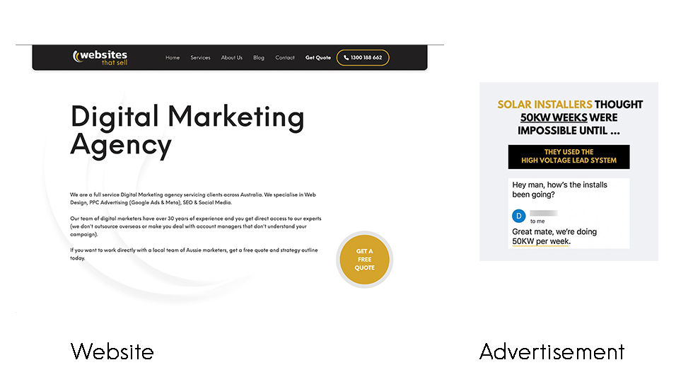
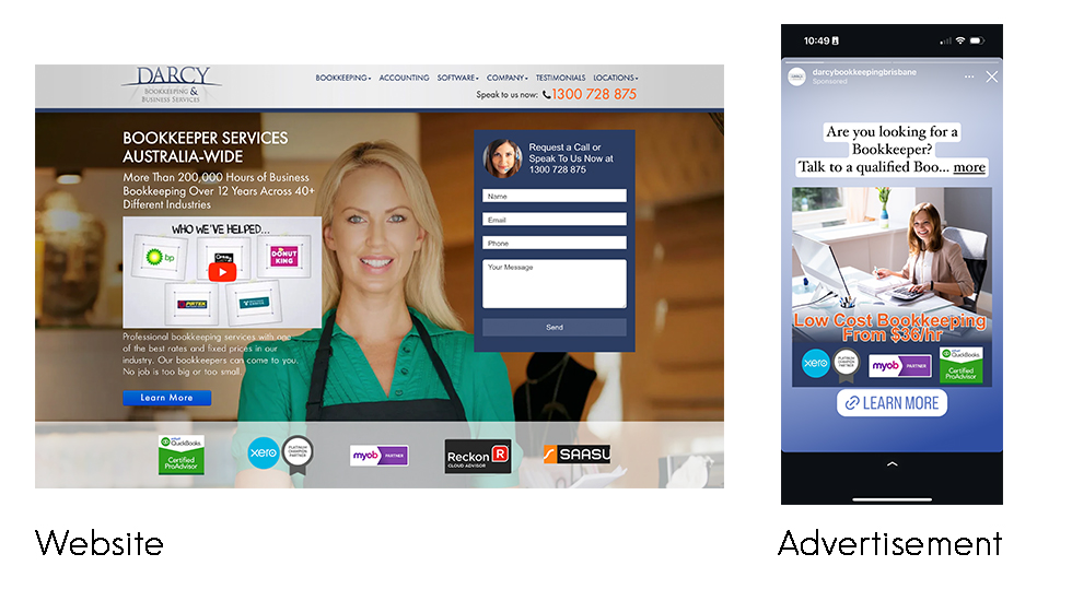
7) Write Headlines That Grab Your Visitors Attention
Why it matters
Most of the time the headline will be the very first thing a visitor sees and will determine whether they stay on the website or bounce off.
It is your website's chance to catch the visitor's attention and communicate the main reason why they should keep browsing.
How to do it
There are different types of headlines to employ on a website to increase conversions.
Headline 1 - this is your main headline that needs to let your visitors know they are in the right place.
Keep it simple and to the point. You have a few microseconds to convince your visitor to stay on the page, don't waste this opportunity by trying to be creative, cute or long-winded.
Headline 2 - This headline should tap into your avatar's core desires. What do they really want?
Hint: it's not your product or service (yet).
You need to ask yourself - Do they want more time, more money or a better life? What's the actual outcome they are after?
The secondary headline should tap into this desire and make a promise that you can get them closer to this desire or away from the pain they are currently feeling. This is one of the most critical areas of your homepage to get right as it is ultimately what makes visitors stick around and buy.
Case Study Examples
Some of the highest converting websites we have built have simple, to the point, headlines.
Remember, the market is ready to buy and actively looking for a solution. Don’t fall into the trap of writing a “cute” headline. They just need to know they are in the right place.
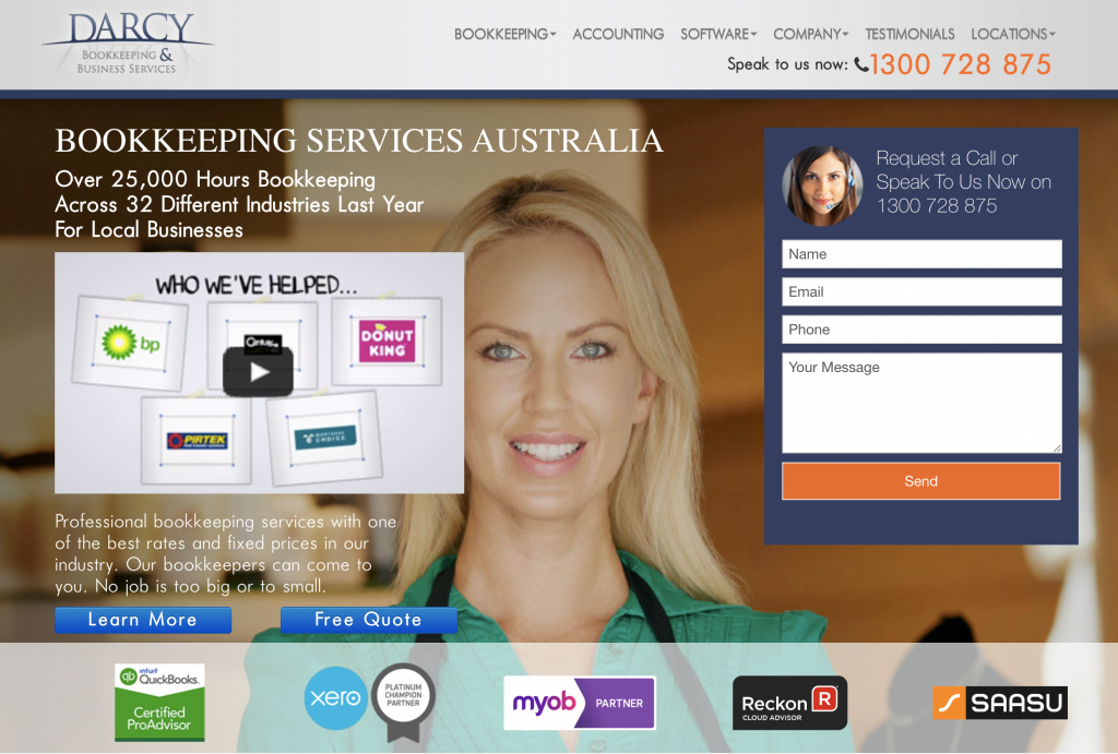
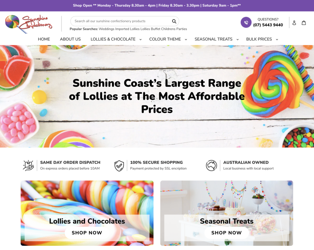
Here’s a few examples of this working in action.
A bookkeeping business:
A local lolly shop:
8) Give Visitors "A Reason To Choose You" And Watch Conversion Rates Soar
Why it matters
Your website needs to clarify what makes you different and what benefits your product or service provides.
You need to answer:
“Why should the visitor choose you over every other business out there?". We call this tapping into the customer's core desire. Think “sell the sizzle, not the steak”. Then package this with all the reasons that make you different.
For example, is it price, location, speed of service, product range... are you a one-stop-shop... do you go above and beyond?
Doing this exercise alone will give you better clarity about your business and what kind of message to lead with.
How to do it
One of the easiest ways we’ve deployed this conversion strategy is by simply giving reasons why someone should choose our clients products or services.
Eg.
7 Reasons Why You Should Choose Our Plumbers
5 Reasons Our Outdoor Lights Outshine The Competition
21 Reasons Our Customers State Why They Chose Our Clinic Over Any Other One In The Area
Case Study Example
9) Localise your content
Why it matters
One thing that copywriters say to increase conversions on websites is to write how you speak.
What we have found is that isn’t 100% correct.
What we recommend is to write like your market speaks!
Why?
Using your market’s language:
- Let’s them know you know understand how they feel
- Let’s them know you’re an expert in the industry
- Appeals to them in terms they are used to.
How to do it
The only way to get this conversion strategy right is to talk to your customers. Interview your customers, record the type of words they use, common language patterns and any industry specific words that are common.
Then use this language, phrasing and words in your copy to better connect and convert visitors.
10) Use Proof To Convert Browsing Into Action
Why it matters
If your website does a good job of positioning what you sell as desirable, you will no doubt have made claims about how good you are. The important thing now is to actually prove what you’re saying is true.
We have a guiding principal when it comes to marketing in general:
“For every claim you make, you need to back it up with proof.”
It’s no different for your website. You may not get another chance to prove your case, at a click of a button your visitor could be gone.
How to do it
There are many ways to prove your case.
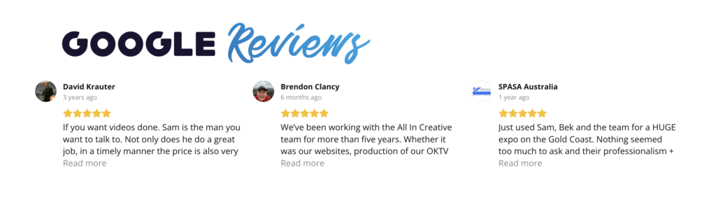
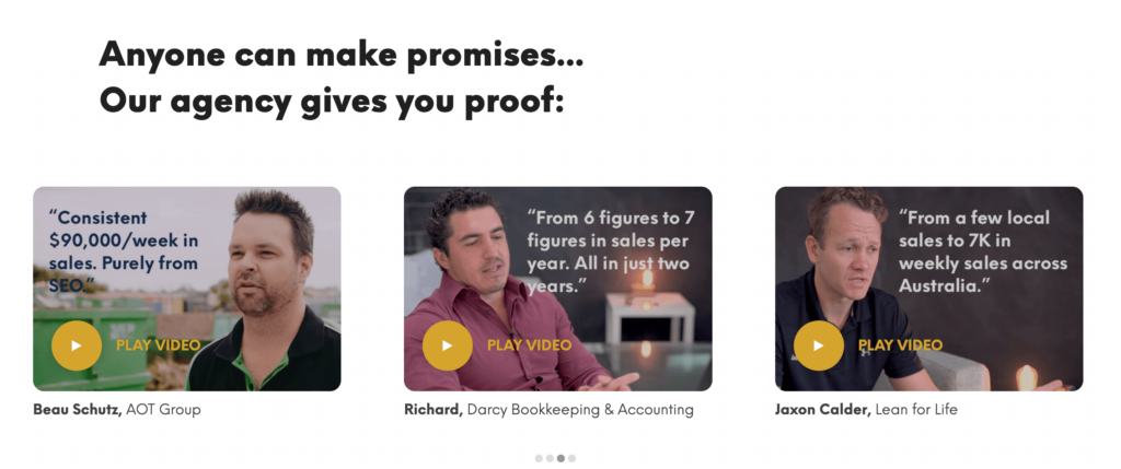
You can use social proof, reviews, case studies, industry figures etc.
Here are some real world examples of how we used proof to increase website conversions.
Case Study Examples
1) Stats, research and industry figures
2) Reviews & testimonials
3) Logos
You can use the logos of companies you have worked for.
This works well if you’re operating on a local level by highlighting other locals or local businesses that you have worked with, or on a national level if you have worked with very well-known brands.
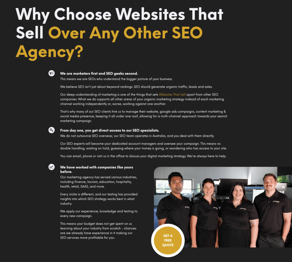
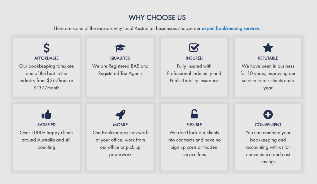
11) Use Trust & Authority To Turn Skeptical Visitors Into Believing Buyers.
Why it matters
This is one of those points often overlooked by mediocre web designers who don’t understand marketing.
When people land on your website that have never heard of you before, it's important to understand these people are sceptical!
They want to know, like and trust you… remember they have a problem to which you have the solution… However, they need to know you are trustworthy and the most authoritative person to help.
How to do it
(ABN, Terms, Shipping Policy, About Us Page, Team Images, Real business location)
The following strategies are proven ways to build trust and increase your website's conversion rate.
- Time in business
- Product range
- Expertise
- Qualifications
- Certifications
- Number of customers
- Number of jobs completed
- Guarantees & Warranties
- ABN
- Terms
- Shipping Policy
- About Us Page
- Team Images
- Real Business Location
Advanced Tip: we encourage you to go to town telling your visitors how good you are at what you do and why, but make sure you don’t forget to communicate what this means to them.
Case Study Examples
We, here at Websites That Sell, are a Google Certified Digital Agency.
Our individual certifications include:

Search Advertising
This includes creating, managing, measuring and optimising search campaigns.

Video Advertising
This includes creating, managing and optimising video campaigns.
And we showcase these on our website to prove we are actually qualified at what we do.
HOWEVER!
If we simply said “Certified Digital Agency”, while it would add some level of authority to our website, to the majority of our market, this doesn’t mean much.
On the other hand...
If we said “We are a Google Certified Agency, which means we have been trained to get the best result for your hard-earned money, making your ad campaigns more profitable,” all of a sudden not only have we achieved authority status, but we’ve communicated how our certification makes & saves you more money!
And that's got to be a good thing. Establish yourself as the authority while wrapping this in benefits that make people buy.
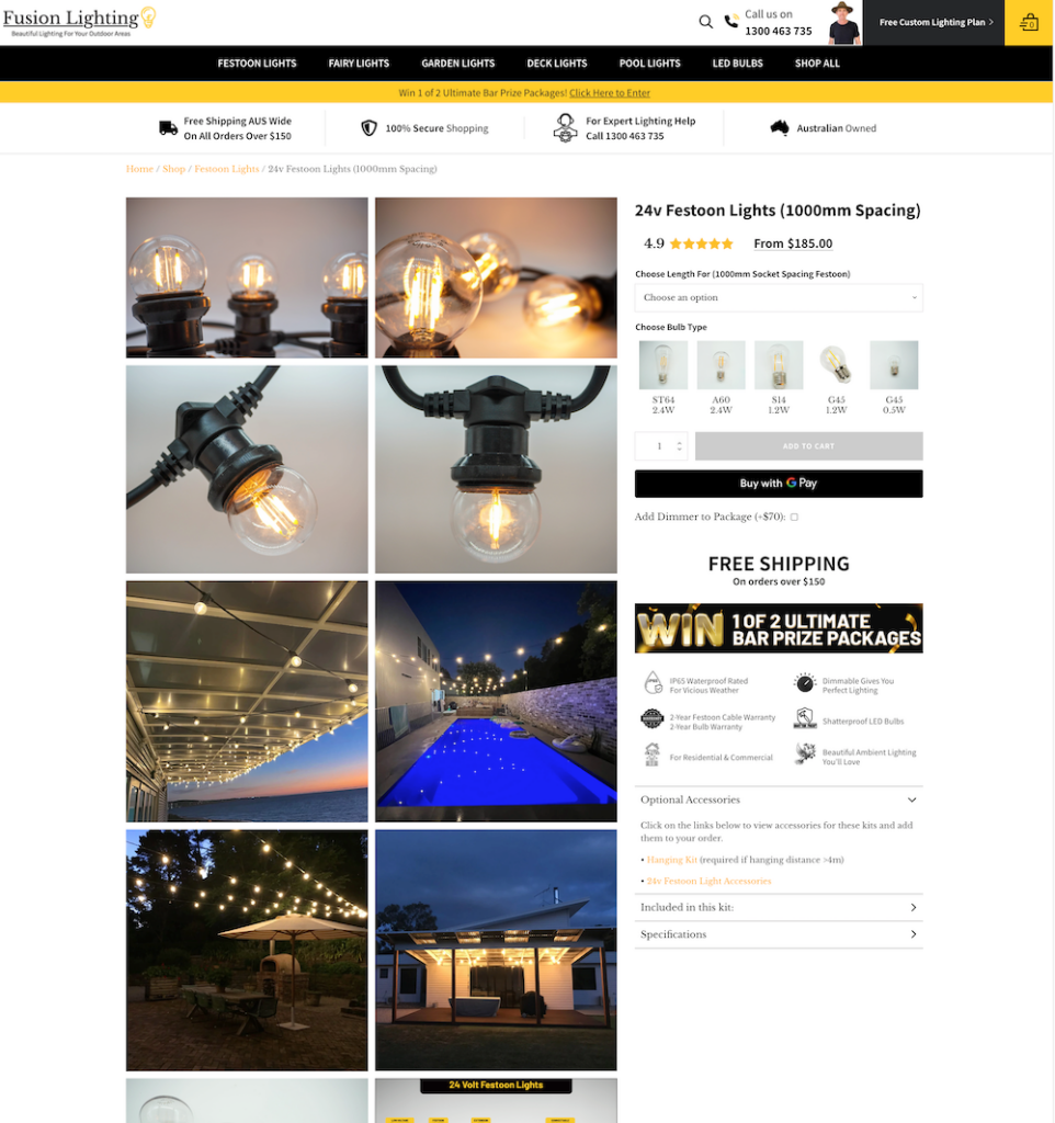
12) Use REAL images of people and your business
Why it matters
A study completed by CXL.com found that when featuring a photo of their client against their top-performing stock photo, visitors who saw the real customer were 35% more likely to sign up.
How to do it
Getting real photos should not be hard in the iPhone age we live in.
Most phone cameras are better than professional cameras were just a few years back.
What we recommend is getting the following type of photos for your website:
- Team photos
- Team in action photos, demonstration of the things you actually do
- Customers using your products
- Customers using your services
- Photos of your business location
Case Study Example
Photos of real customers:
Photos of the business owners in the local area:
Photos of customers receiving the companies services:
13) Use Consistent Branding To Make Visitors Feel They Are In The Right Place
Why it matters
There's nothing like paying for traffic using ads, then people land on your site but bounce because your website looks totally different to the rest of your brand online.
This is not a simple fix as many times this will require a bit of development & design work to get right.
If you feel there is a disconnect between your website and your brand online, it might be time to talk to a web design agency like us to help you rectify this problem.
How to do it
Usually your website colours are much harder to change than the colours & branding used on your ads.
The key is to use the same font, colours and imagery as the rest of your website and brand.
A great way to get this right is to have a brand guideline and hand this to anyone that does any type of marketing activity to ensure they abide by these guidelines.
Case Study Example
14) Map Your Customer Journey
Why it matters
It’s important to understand that every person that visits your website will be at a different stage of your customer journey.
Some visitors may have never heard about what you do, others are long time clients and back to buy again, yet others might be ready to buy but just need to hear the right things before making a purchase.
It’s important that each page on your website is strategised and designed in a way to best speak to the stage of the customer journey the visitors are currently in.
How to do it
Map out the most important pages on your website and categorise them along the customer journey.
5 stages of the customer journey: Awareness, Consideration, Decision, Retention & Advocacy
Here are a few examples to help you get started as a general rule of thumb. However, remember that each business is different.
Blog Pages - typically people land on blog pages that may have never heard of your business, your products or even understand how what your business or product does works. Typically these are visitors in the awareness stage and these pages need to be informative and educational in nature to convert visitors to the next stage of the customer journey. These pages also serve really well to help people in the advocacy stage share information about your business to others that are in the awareness stage.
Homepage - this usually is a page where customers are aware of your brand and/or the product you sell. It’s important to translate proof, authority & trust to guide this traffic along to the decision making process of their journey.
Product/Service Pages - people that reach these pages have already made the decision to buy or invest into your services. The content on these pages doesn’t need to be educational and explain why a person needs what you have. Instead, these pages need to focus on why you or your product is the best choice for them.
15) Set A Single Clear Goal Per Page
Why it matters
If you give people too many options, you’re going to confuse them. One call to action is the rule of thumb.
This is important because you can be very clear & specific with your headlines & copy. A proven way to increase conversion rates.
Each page on a website serves a purpose in converting the visitors into the next stage of their buying journey. Having the one, and more importantly the right call to action, on a page is a critical factor in increasing a website's conversions.
How to do it
This strategy builds upon understanding your customer's journey.
Once you identify which pages relate to different stages of the customer journey, it’s important to ask the question “what is the next step I want my visitor to take here?”
If they are on the homepage, do you want them to learn more? The call to action would be to send them to blog posts.
Do you want them to view your products or service offerings? The call to action would be to visit your product or service pages.
Is the sole purpose of your website to generate phone call leads? Make the call to action blatant and obvious across your website to get people to call you.
A page to generate leads/opt-ins, should not sell a product, it should only have the one goal of converting the visitor into a lead.
Same with a product or sales page. The only goal of these types of pages should be to convert a browser into a buyer.
Case Study Example
Example of a high converting lead generation page:

Example of a high converting product page:
16) Make It Easy to Find Stuff on Your Website
Why it matters
One of the biggest problems we uncover when helping clients improve their website conversion rate is that it’s hard to find the obvious.
If you want people to find out more information about the services you offer, make it easy to find them.
If there are common questions people have, make sure it’s easy to find FAQ’s around these.
The easier you make it to find stuff across the site, the higher the chance that people will engage and stay on the website for longer periods of time.
All our testing proves that the longer someone stays on a website, the higher the likelihood of them converting into a subscriber or buyer.
How to do it
Build out a sitemap of your most important pages.
As a general rule of thumb, make these pages ideally only 1, no more than 2 clicks away from the homepage.
For example, if you are a plumber with various services available, showcase these services in the menu and ideally on the homepage, where with one click the visitor can land on these pages.
If you operate an eCommerce store, depending on the size of the store, this might be impractical. If you have a big product inventory broken down into categories, the right option here is to send people to the top level category page and through to the relevant products from that page.
The best way to get this right is to map the website architecture out manually and then build or organise the site around this architecture.
17) Use "Call To Actions" (CTA's) The Right Way
Why it matters
Your website must have calls to action. We usually like to have a primary call to action (eg. phone number to call, or form fill) however it depends on your business.
Whatever next step your visitors need to take needs to be clearly displayed and repeated throughout the homepage.
How to do it
Remember, on the internet we are dealing with click-trigger-happy, fast-scrolling, attention-deficit people. That's why at every step of the way, we have to give our visitors directions.
- If you want phone calls, make sure you feature your phone number loud and clear.
- If you want enquiries via email, have an enquiry form on the site with a call to action to fill out the form.
- If you want people to download something, tell them how to download it.
Whatever the goals and objectives you want to achieve on your website, make sure you give people direction on how to go about it.
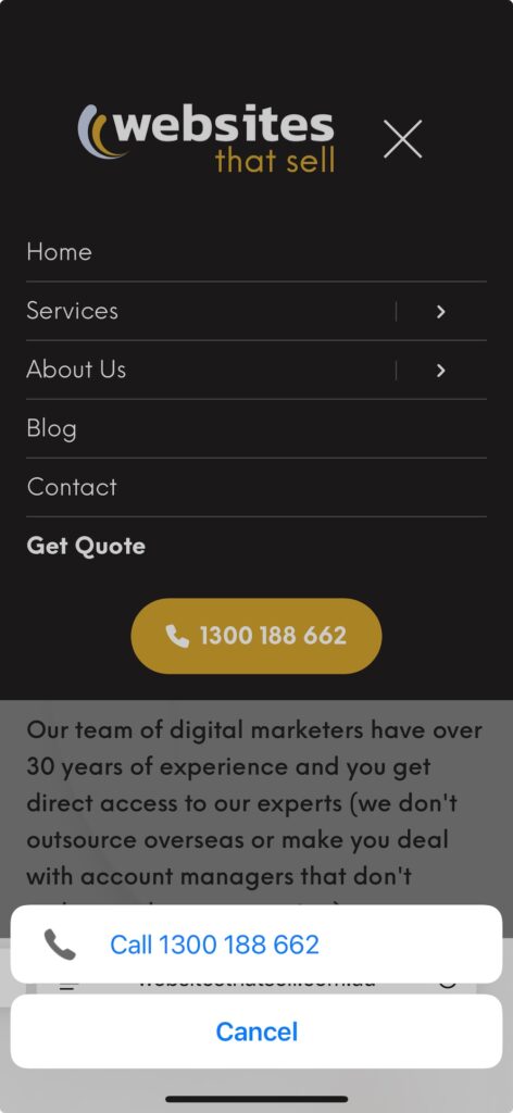
18) Implement Click-to-Call & Tap-to-Text
Why it matters
Every industry is different, however we have all been part of the mobile shift over the last 10 years.
Websites are experiencing a dramatic increase in mobile traffic and to convert these visitors, it’s important to make phone buttons easy to click-to-call or even tap-to-text
How to do it
To make your buttons or call to actions click to call, wrap your button or text in the following code and replace the current number (1300 188 662) with your phone number.
<a href="tel: 1300 188 662"></a>
You may need the help of a developer to implement this across your website.
Case Study Example
Here is an example of a “click to call” activated button. Notice how on the click the phone feature gets activated.
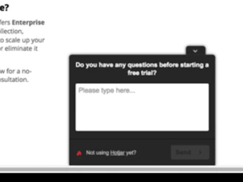
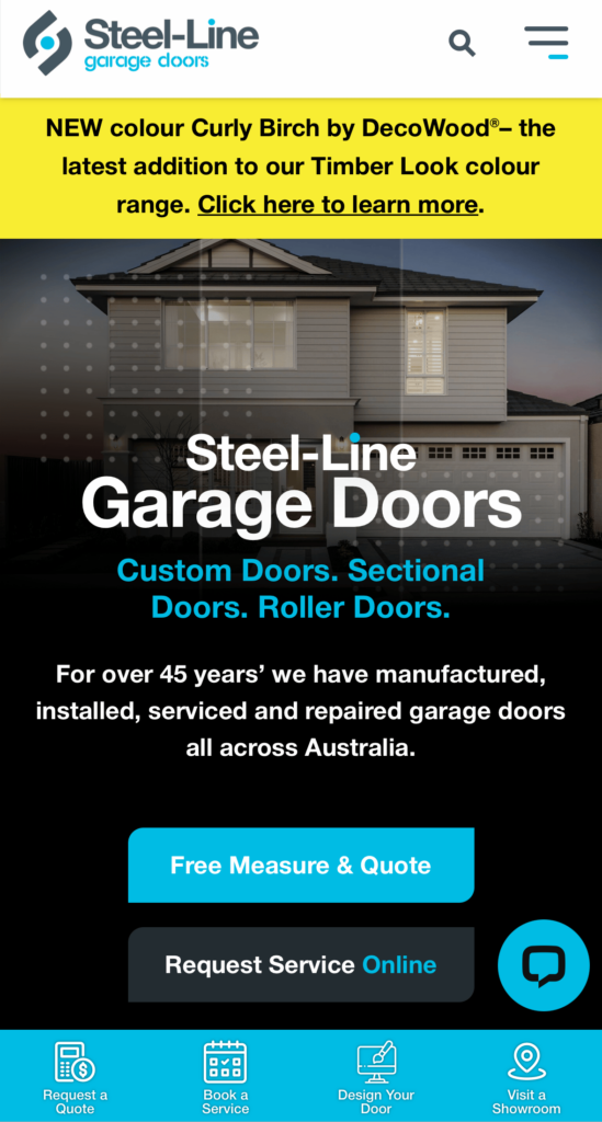
19) Add Live Chat
Why it matters
Live chat is a great way to answer questions and provide support for website visitors.
We have seen chat work best for industries where visitors have lots of questions before taking their next step.
Travel, Real Estate, Healthcare, eCommerce and SaaS websites are famous for live chat working really well to provide answers as well as real-time support.
However, for our clients in Australia, we’ve also seen chat work really well for builders, electricians, medical specialists and garage door installers.
How to do it
Installing a chat system is as simple as signing up for a service and installing the feature on your website.
The following software has good reviews and user stats across the internet:
- LiveChat
- Tawk.to
- ZenDesk
- LiveAgent
In our experience,using a real person and an image of a real person will greatly increase the effectiveness of the chat and get website visitors to engage with it.
In addition, there are a lot of AI capabilities these days to increase conversions of chats without having to employ someone to answer messages manually.
20) Offer Free Stuff
Why it matters
The word FREE is one of the highest attention grabbing words to use in advertising.
Using it on your website will not only catch more peoples attention, it will also make them more likely to engage with your offer.
How to do it
If someone isn’t going to complete a form or pick up the phone and call, ask yourself, what can we give them for free, with no strings attached, in exchange for their email address?.
What has worked really well for our clients across a variety of industries is things as simple as:
- Free Quotes
- Free Shipping on orders over $$$
- Free Consultations
Case Study Example
Here is an example of a free site inspection offer for a construction company.
And our very own free quote offer here at Websites That Sell.
21) Use Incentives
Why it matters
However people found your website, it will have cost you marketing dollars.
Whether it be by brand recognition, offline advertising, SEO or paid ads - you paid money in some way shape or form to get them there.
The rule of conversion rate optimisation is to do whatever it takes to ensure no visitor leaves without taking some kind of action.
If someone isn’t ready to buy or needs extra encouragement to buy, offering incentives is the perfect way to get visitors to take that next step and convert.
The way we achieve this for clients is offering discounts, lead magnets or by running giveaways.
How to do it
Offering discounts is pretty simple, you can simply apply this on specific products, storewide or as a banner ad on your website to say you are running a discount sale.
The lead magnet should be given away in return for an email address.
Depending on the value of the giveaway, you could start with the visitors email address and go all the way to their phone number, physical address and even more information.
The key with using incentives is that the value needs to be high enough for the visitors to part with their information.
The key here is testing and seeing what level of information requested gets the best conversion rate.
22) Offer Guarantees & Warranties
Why it matters
Have a think about it… if you were skeptical about a product or business but they offered a 100% money back, nothing to lose, no strings attached guarantee, it would probably make you give the product or service a go.
Right?
That’s the power of a guarantee, it removes all the risk from the visitor and dramatically boosts conversion rates.
The same is true for warranties. Being covered by warranties gives your customers and visitors peace of mind that not only do you stand behind your product & services, but in the unlikely event there was ever a problem, they can expect customer support.
This removes a lot of risk and allows trust to be built which has been proven to increase a website's conversion rate.
How to do it
Advertise your guarantees & warranties front and centre.
For really great guarantees,we’ve even used them for different promotions in the headlines of the website.
At minimum, guarantees and warranties should be very easy to find and not hidden away.
Case Study Example
Here is how a plumber in Sydney used a guarantee offer to get visitors to take action, in effect increasing quote requests & phone calls.
23) Create Genuine Scarcity
Why it matters
Scarcity has been used by marketers for centuries to create urgency through limited availability or time-sensitivity in order to boost sales. It works just as well for websites.
We’ve already talked about using free stuff & incentives to increase your website's conversion rate.
Adding scarcity to these strategies will supercharge your results!
How to do it
Implementing scarcity is easy and we’ll provide some examples below.
But… and this is important - the scarcity needs to be believable.
You can’t say things like “Only 50 Copies Of This eBook Available!”
Everyone knows there’s an unlimited supply of eBook downloads available.
However you can say, only available for free for the next 7 days.
Or only ‘5 free consultations available this month, 3 have already been booked!’ There’s 2 spots left, and your visitor suddenly feels the urge to book right away.
The art is to make sure the scarcity you create is actually believable.
Two scarcity factors that have and will continue to work really well in future are:
- Limited Time Availability Of The Offer
- Limited Quantity Availability Of The Offer
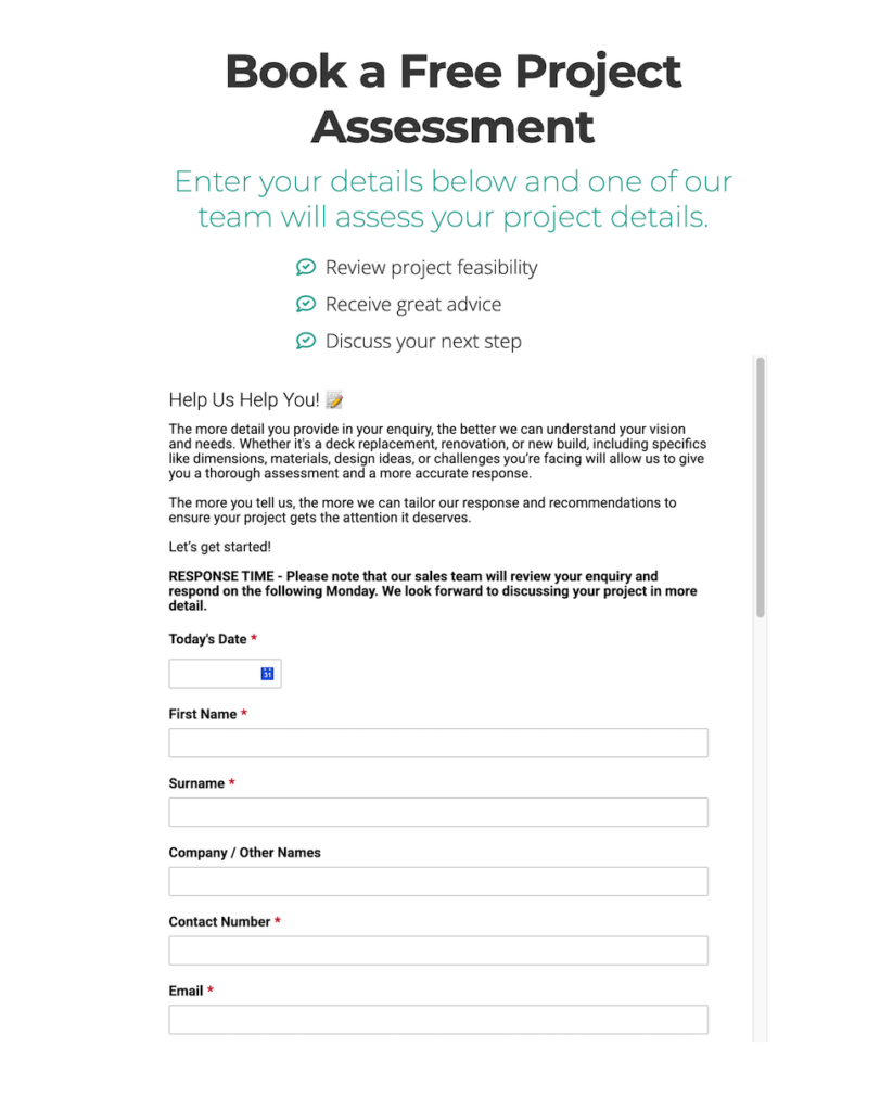
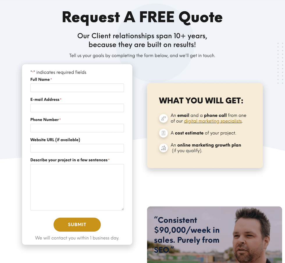
24) Shorten Form Fields
Why it matters
The more information your forms request, the less likely visitors are to fill them out.
There is a flipside to this… the more information your form fields provide, the higher quality leads you might receive, so you need to decide which is most important to your business - high quality leads or high volume leads?.
How to do it
We always start with the bare minimum form fields to maximise conversions. Once we have our conversion rate control - we test.
This can mean less form fields, different fields and more form fields and we analyse the results of the campaign with each implementation.
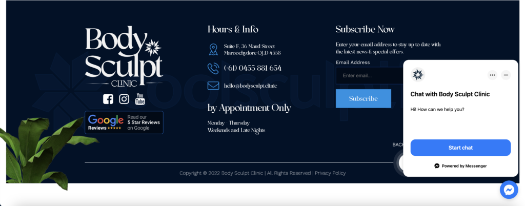
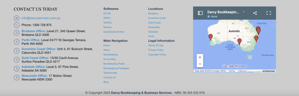
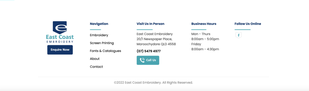
25) Optimise Your Footer To Get Clicks That Would Otherwise Bounce.
Why it matters
This is one of those functional areas you do not want to neglect.
Why?
Because when people scroll all the way to the bottom of the page and have seen everything on the page that they need to know - you want to give them options to continue or convert instead of clicking away from your site.
How to do it
A lot of visitors still use this area to navigate to other pages. Fill your footer with the most important top-level pages you want your visitors to find.
Where historically your footer will have your about & contact page links, place some of your best content for prospects to consume in this area as well.
Case Study Examples
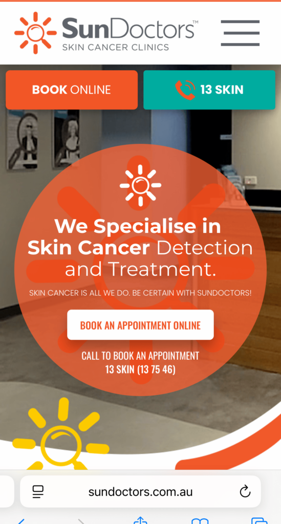
26) Optimise for Mobile First not Just Mobile-Friendly
Why it matters
We are well and truly into the mobile age, and just having a desktop friendly website isn’t going to cut it anymore if you want to increase conversions from mobile visitors.
The key to increasing your conversion rate on mobile is prioritising the mobile user experience from the outset, which will make the user experience better, improve SEO and even provide a higher likelihood that Google will prefer your site in the SERP’s.
How to do it
Implementation of mobile first starts in the design phase but what has worked for us really well at the most basic level is following this process:
- Get in the mind of your mobile users. Hint: visit your website on a mobile device.
- Check all conversion elements are properly optimised for mobile screens.
- Make sure all elements are “thumb friendly” meaning people can use their thumbs on mobile to click or take actions.
- Test on multiple different mobile devices and get real people to use the mobile version of the site for feedback.
Case Study Example
Here are examples of high converting mobile versions of websites:
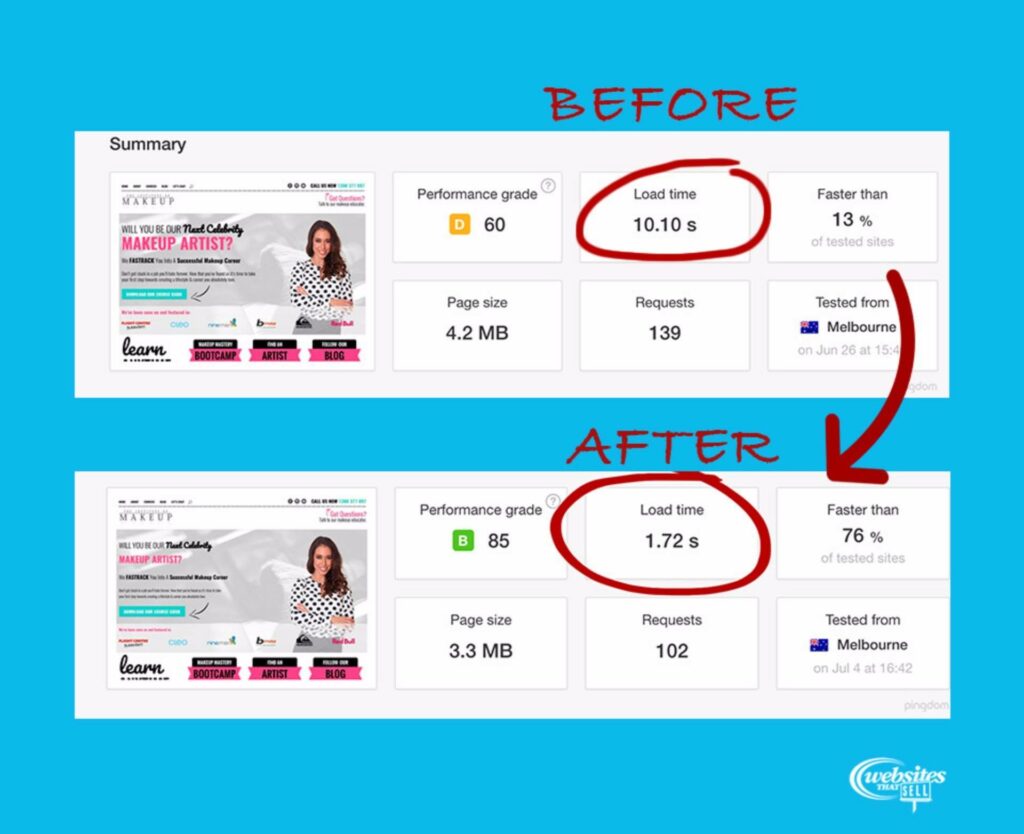
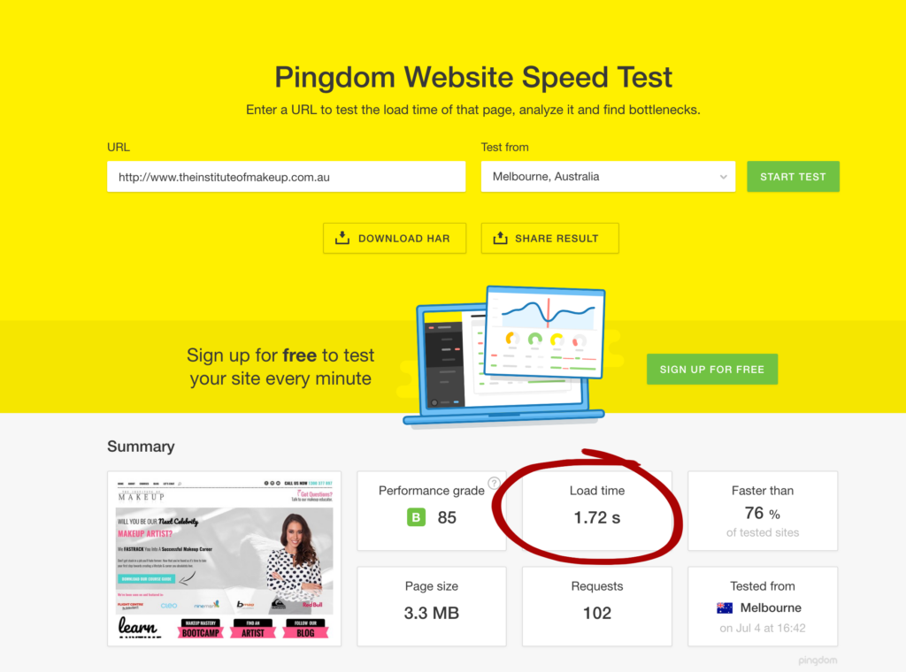
27) Improve Website Speed
Why it matters
A faster loading website is always going to give a better user experience and therefore increase conversions.
Although there comes a point of diminishing returns on investment.
So it’s important to keep this one simple.
If a website takes over 10 seconds to load, you have a problem, and you’ll get a good return on investment by bringing this down to a couple of seconds.
If your site already loads in less than 1 second, your return on investment to make this even faster isn’t going to be that high.
How to do it
There are many ways to increase website load speed, however the 2 first places to check are:
- Server Response Time - if your website is hosted on cheap, slow or outdated technology you could get a dramatic boost in site speed just by changing to more premium hosting.
- File Size - if your site is filled with oversized images and other big files, another quick way to get a big boost in site load speed is reducing the size of files across your website.
Case Study Example
We helped a client migrate her servers and just applying method No.1 - changing servers we were able to boost the clients website load speed from 10.10s down to 1.72s
BONUS TIP: How to Get Higher Quality Leads Even If It Means Decreasing Your Conversion Rate
One of the things that has dramatically increased our conversion rate, and this is more of a marketing strategy than something to just implement on a website, is to “offend to attract”.
What we mean by this is make your website only speak to your target market.
Anyone that you don’t want to convert will not convert from your messaging, however the exact people you do want to convert will respond much better.
It’s important to understand your target market for this strategy to work, however once you get it right, your website will convert & produce much higher quality leads & sales
Proof Our Website Conversion Strategies Actually Work!
We built a website that generated 377 website conversions (calls & enquiries) IN A SINGLE MONTH at just $10.50/conversion!
Not only did we drive all those phone calls & website enquiries, but the business owner converted 3 out of 5 leads into a sale. And he's been doing it month, after month, after month ever since!
That's the kind of quality leads a high-converting website can produce!
Here’s proof these outrageous claims are true:
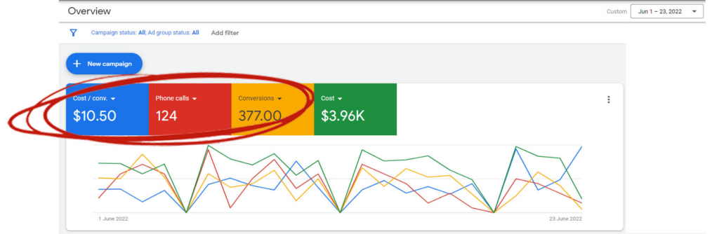
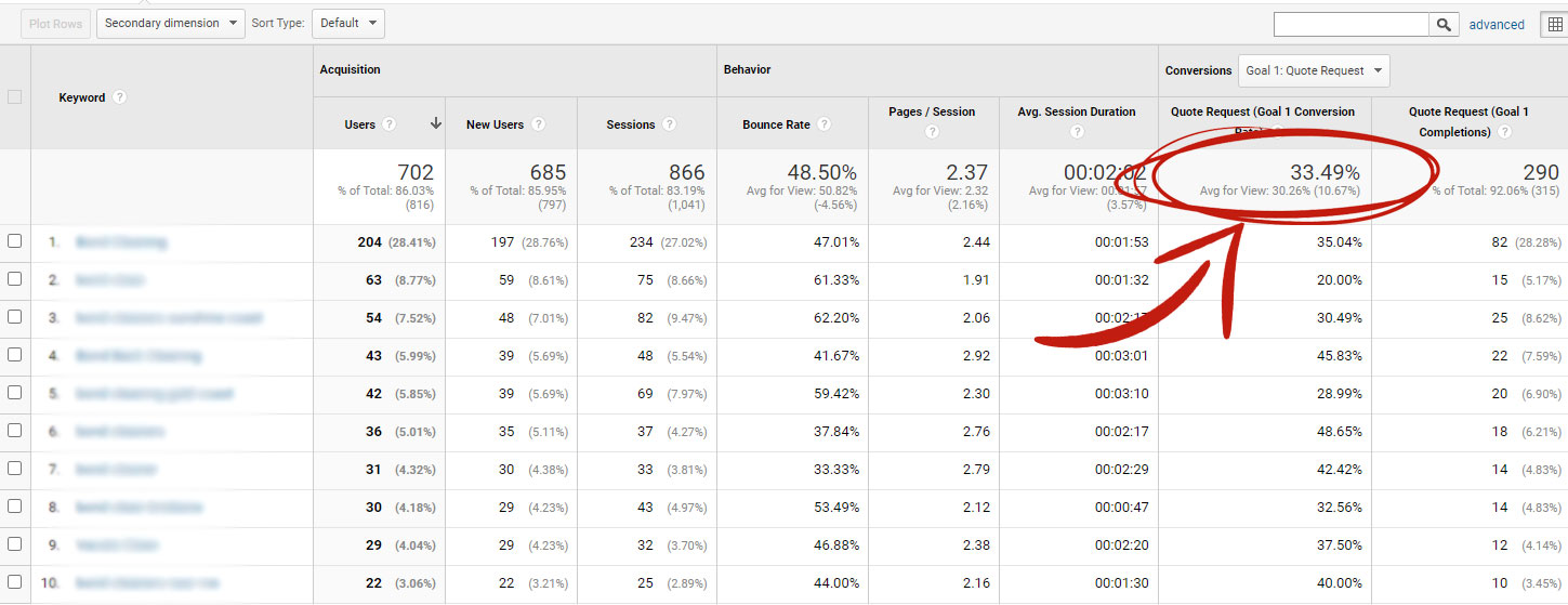
For those that like the numbers… this website converted 33.49% of people that landed on it.
We did all this without a big social media following, without a comprehensive online marketing strategy and without the latest “funnel hack, but by using the strategies in this guide.
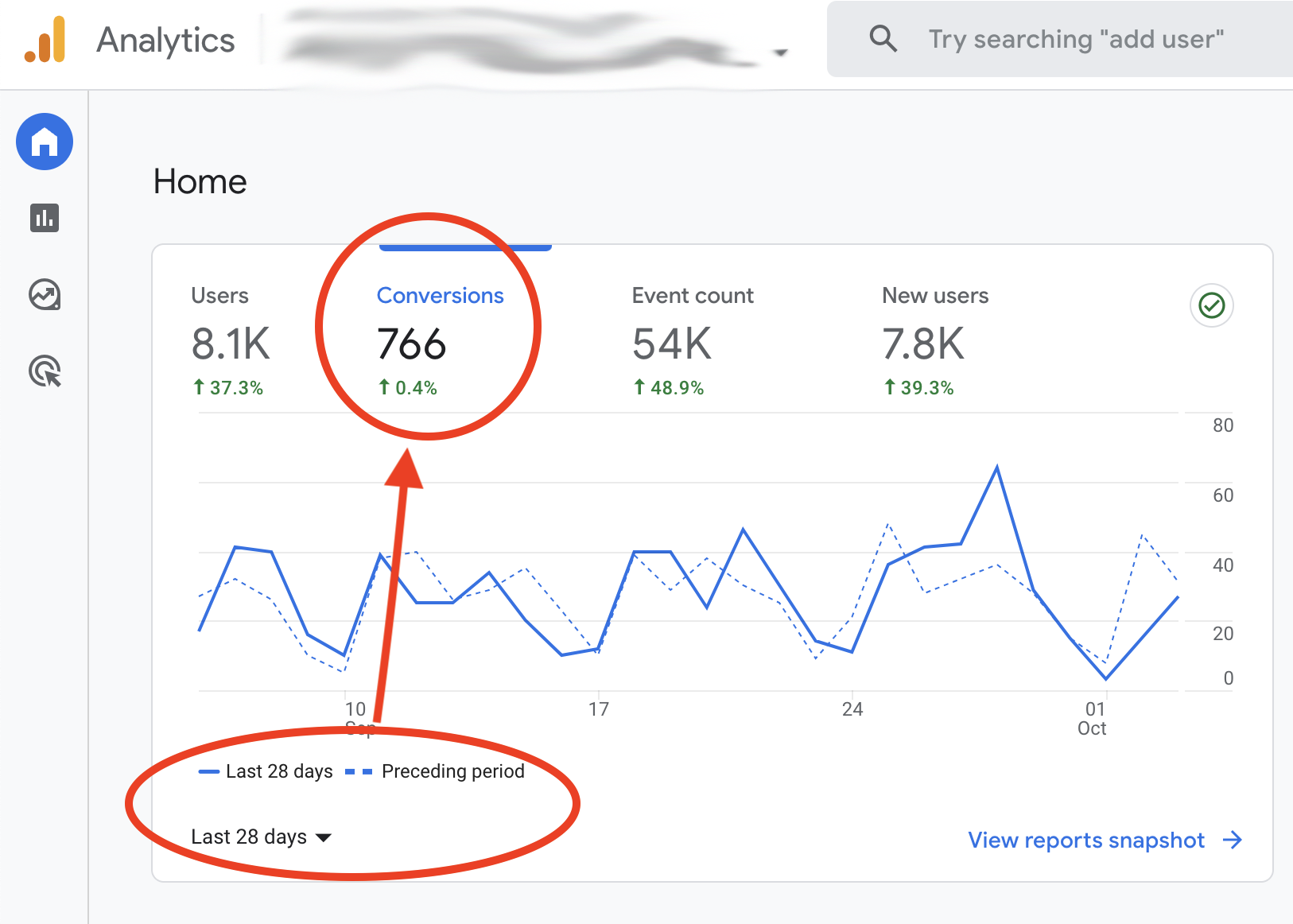
We generated 766 website enquiries for a skip bins company in 28 days
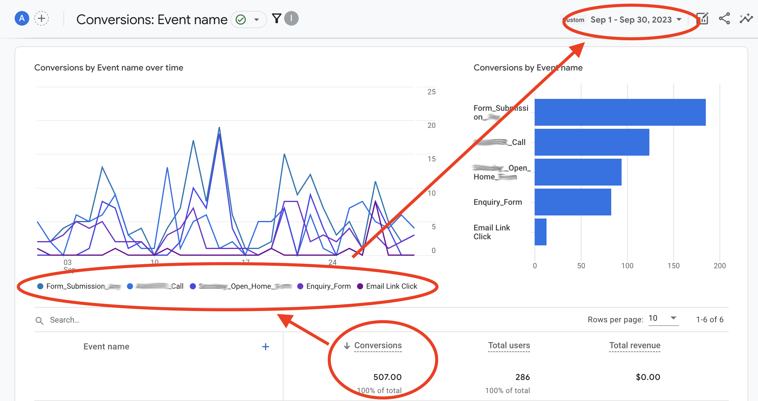
We generated 507 conversions (phone calls, form submissions, emails) for a local builder in 30 days
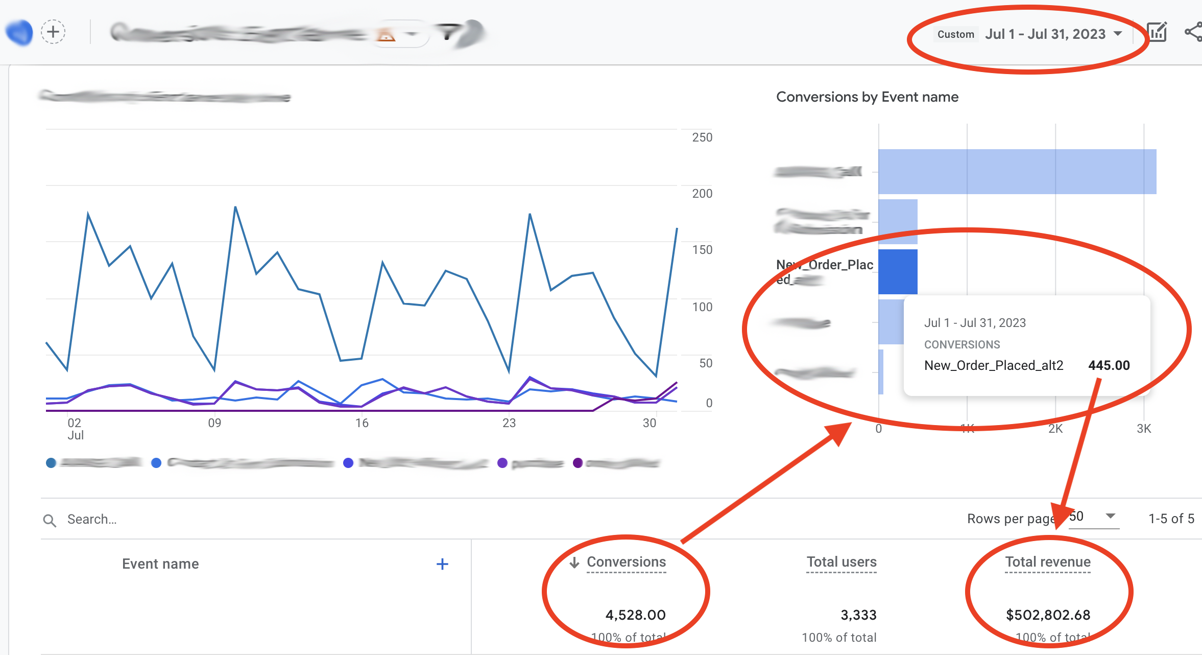
We helped an eCommerce store generate 4,528 conversions, 445 purchases which resulted in $502,802.68 in revenue - all in 31 days.
We're ready to share what we did to achieve this kind of success, but before we do its important to clarify what a website conversion is.
Do You Need Help Increasing Your Websites’ Conversion Rate?
You’ve now got all the information you need to start deploying our most effective website conversion strategies on your website.If you still need more help, you can reach out to one of our team to discuss your project and see how our web design services work and if we can be of help. Give us a call on 1300 188 662 and one of our website specialists will be able to help you decide the best next steps forward.