SEO Services By An Australian Agency
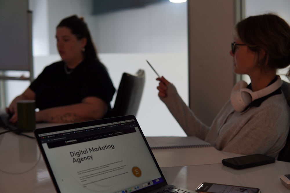
We are a digital marketing agency specialising in Search Engine Optimisation (SEO) in Australia. Our SEO services include Local SEO, eCommerce SEO, and International SEO, as well as specialists SEO services such as technical SEO audits, keyword research, on-page and off-page SEO (including link building), content creation, semantic SEO, topical maps, SEO consulting, and strategy.
Our SEO company has a proven track record of results, and we have case studies to back this up. Our SEO specialists have over 30 years of experience ranking websites on search engines.
If you want to work directly with our SEO team who know the Australian market (we don't outsource your campaign overseas) - get a free quote & SEO strategy today.
Not sure yet? Tell me more
Yes! Help me run my adswe are Google partners


Why Choose Websites That Sell Over Any Other SEO Agency in Australia?
Our SEO Services
We have found that every SEO strategy requires a different marketing approach to increase your online visibility. Our SEO agency can provide a fully managed search engine marketing campaign (which are our more comprehensive SEO services) or custom SEO services as follows:
Local SEO services including website localisation, content creation, backlinks, keyword research, Google Business Profile, Citations, Reporting, Audits, Consulting & Reputation Management.
By utilising local SEO strategies, Google Maps your GBP, Our local SEO services will get your business found by customers near you.
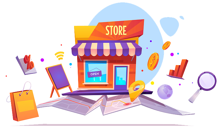
Ranking eCommerce sites involves optimising your products and category pages while building a content engine to attract more new and repeat customers to your store.
This ranks your website's products on Google's search results, Google Shopping, and in the recommended products section of Google's generative AI experience.
International SEO services include technical aspects like Hreflang Tags, gTLD and proper canonicalisation. Our specialists understand how to localise your website for foreign markets so your message correctly translates for a multilingual target audience.
This SEO service is the last SEO audit you will ever need. Our SEO audits include a complete analysis of your site, including historical content. We examine the top-ranking factors of every page and compare your website to your competitors'.
This audit gives us all the data we need to repair your site's foundation, structure and launch your campaign with a bang.
As part of our keyword research services, we identify keywords your target audience and your ideal customer may use to try and find your products or services on search engines.
We utilise market research, Google Search Console and local market knowledge to identify the best keyword opportunities for your business.
On page SEO includes basic SEO optimisation such as meta tags, H tags, headings and images.
This method of optimising a website's content builds theme relevance, which we have found to still be a significant ranking factor in the algorithm in 2025.
Links are crucial for your site's power and authority. Examples of backlink techniques include citations, outreach, and niche-relevant links.
As part of our link building process, we first inspect your backlink profile. This gives us an idea of how your link profile compares to those currently holding your dream spot at the top of the search results. We then map out what kind of links are required to increase your website's authority over theirs and get your site climbing up the search engines faster.
As part of our content creation services, we strategise and develop content for landing pages, service pages, product descriptions, blog posts and any other areas of your site that require attention.
Our team is trained to write “helpful content.” This means less fluff and more well-structured content that best answers visitors' questions while making it easy for Google to understand and rank your website.
Semantic SEO services focus on Natural Language Processing (NLP) and deep algorithmic learning. As part of this service, we will develop a topical map and deploy a semantic content network on your website, increasing its reach and building its topical authority.
Our team has been trained to understand your market's specific words and phrases and how they relate to your business. This results in content that better answers your audience's questions. This helps your website rank in more places on Google's search results with greater long-term stability and gives your content a higher chance of being considered for Google's AI Overviews.
We've consulted and acted as SEO advisors to corporations of many shapes and sizes.
As part of our consultations, we research what your website needs to rank in your industry.
We then provide a SEO strategy and ongoing advice for your team to execute.
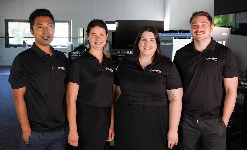
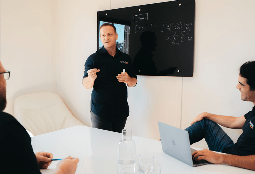
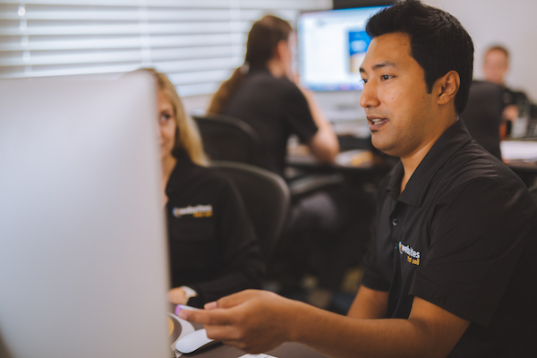
Meet Our SEO Experts
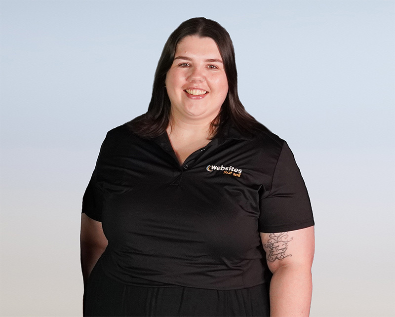

Here's what makes us SEO specialists.
Having worked on over 563 digital marketing campaigns, we know how Search Engine Optimisation works and have the experience required to qualify as SEO specialists! And the results our SEO marketing services produce is proof of this.
We took on our first ever SEO client in Australia in 2010, and they still rank at the top today!
Our SEO experts have over 30 years of combined experience.
We've been there for every Google update, have recovered from Google penalties and are still here today.
We survived the Caffeine Update in 2010, Panda in 2011, Penguin in 2012, Exact Match Domain (AND we understand why sites that survived this update rank better than ever in 2025), Hummingbird, Pigeon, Mobilegeddon, Rank Brain and every Core Update since.
Our SEO company not only knows what works today, but we know why and can adjust your SEO strategy accordingly.
We understand how content works in the world of semantic SEO today, which backlinks impact SEO ranking, what page structures get consistent results, and how to give Google the information it wants and the format it likes.
This level of SEO expertise doesn't come from just using AI SEO tools but rather a deep understanding of how search engines work, their history and what still gets keyword rankings today. It's what makes our SEO services work on traditional search engine results pages as well as in Google's most recent Generative AI Search Experience.
Lastly, we've run our own SEO agency for over 10 years. We know what it's like to work with an SEO agency and what it takes to survive in business. That's why we strive to make working with us not just a great experience but one that gets long-term results!
SEO Case Studies: proof our SEO company gets results.
Case Study 1
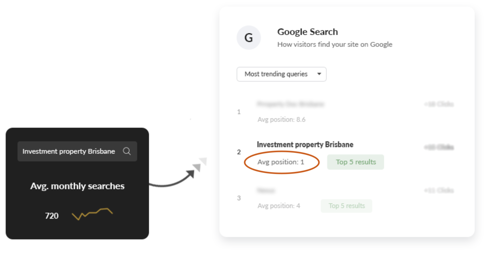
Content Strategy Takes 720 Monthly Search Volume Keyword Into The No.1 Position On Google.
The Problem
The client had no presence in the search engines for searches relevant to their business.
The Solution
Start a content marketing campaign combined with a targeted SEO strategy.
The Strategy
Create a content piece targeting a theme of keywords. Then optimise the content piece in a way that leveraged the websites authority to make it rank.
The Result
No.1 ranking on Google for a keyword that gets 720 monthly searches, and would have cost up to $5.43 per click using paid advertising.
Case Study 2
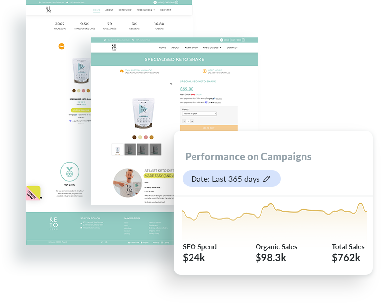
eCommerce SEO campaign boosts Sunshine Coast online store from a few local sales to $7,000 in sales a week.
The Problem
The companies website wasn’t ranking for any related product searches on Google.
The Solution
Optimise the product pages and run a SEO campaign directly at these pages to rank them.
The Strategy
Target high commercial intent product related keywords.
The Result
The company hit the top spots on Google for key product phrases. As a result the site went from a few local sales to $7,000 in weekly sales.
Case Study 3
Google Business Profile generates 233 phone calls & 114 business directions in one month.
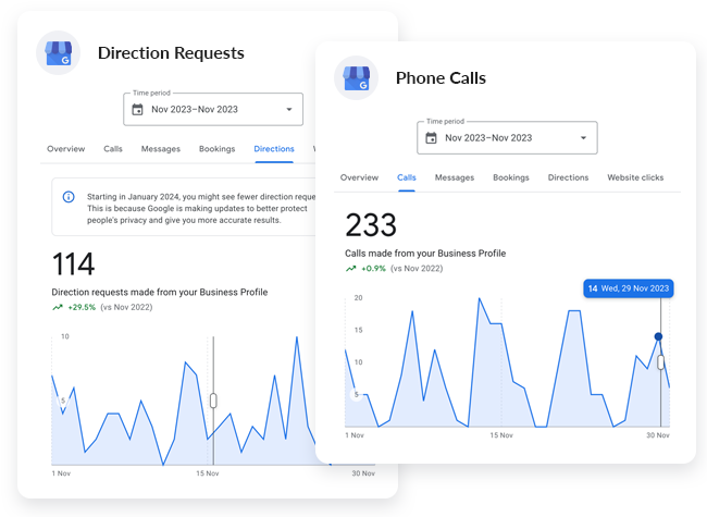
The Problem
While the client ranked organically on Google, the business had no visibility in the maps pack.
The Solution
Optimised the Google Business Profile. Create fresh content to feed into the profile. Build out local link profile.
The Strategy
Implement a Google Business Profile (GBP) specific SEO campaign.
The Result
The Google Business Profile generated 233 phone calls & 114 business directions in a single month!
Trusted By Local & National Brands


WE BUILD BUSINESSES
How We Can Help You With SEO
We are marketers first and SEO geeks second. We think that is what makes our SEO company unique.
It's not good enough for us just achieve search engine rankings... Unless the organic traffic we drive results in more leads and sales, we don't consider our SEO strategy a success.
To achieve success, we focus on 3 things as part of our SEO process.
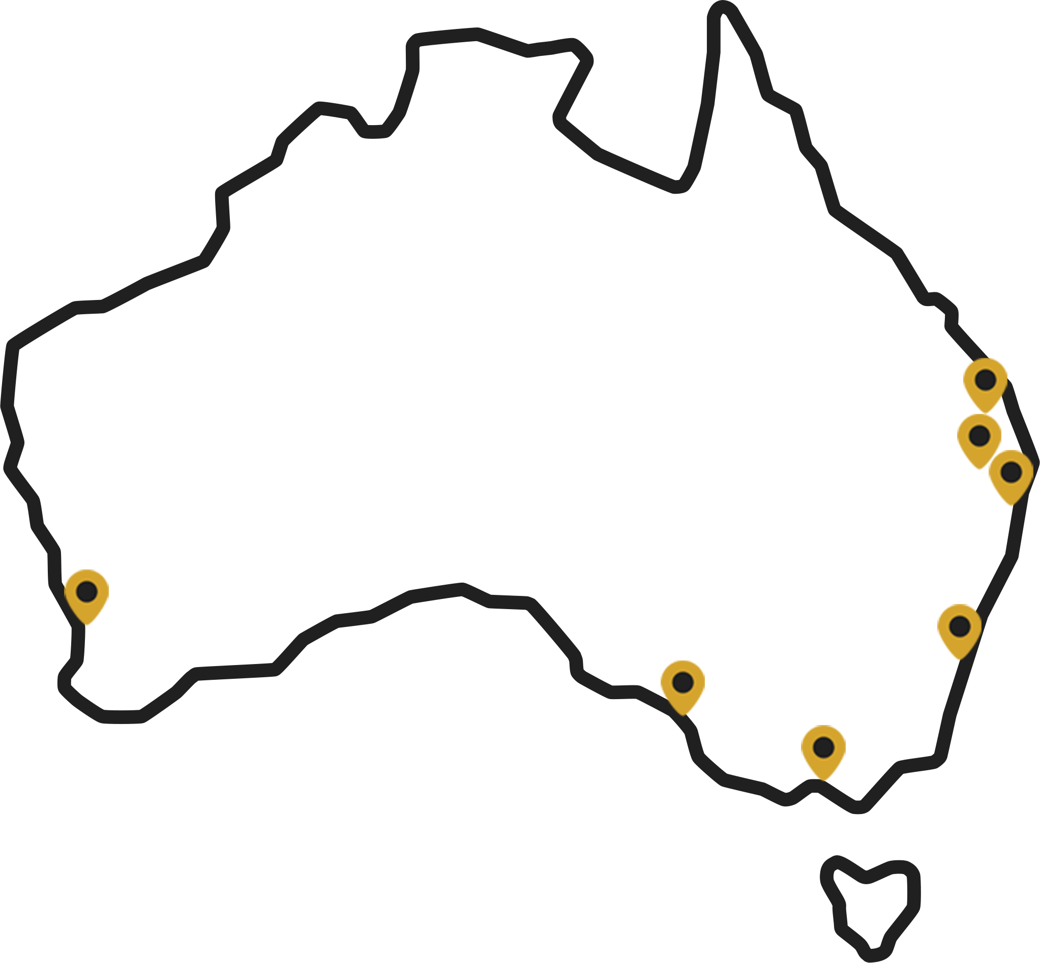
Areas our agency services across Australia:
frequently asked questions
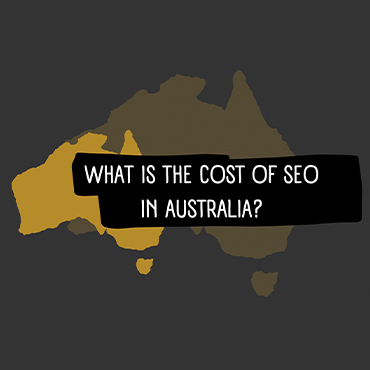
We allocate hours to all our SEO services and our hourly rate is $150+GST. The actual SEO cost will depend on the SEO strategy and competition level. Our starting point for any SEO campaign is $3,000+GST month.
SEO is a long term investment. While we get ranking results within the first few months, for additional organic traffic, leads and sales to flow from the SEO strategy, it usually takes 4-6 months.
What we have found in recent years is that content and links mature after 12 months and this is where true ROI is achieved.
If you are not looking at your SEO efforts as an investment for business growth, hiring a SEO agency may not be for you.
We consider ourself a white hat SEO agency. We understand and follow Google's Search Engine Guidelines and best practices to achieve higher rankings in the search engines.
We have been ranking sites in the search engines a long time and we value our clients long term success over our own short term gain. Doing things right and by the book helps us stay on this course.
We have found SEO to be a very effective in building a companies online presence. However, there are also industries and instances where we have found SEO marketing not to make sense.
For smaller businesses, with low turnover and tight margins it does not make sense to pay an SEO company to build their online visibility. The better approach would be to implement basic on page SEO, and create quality content that will drive more relevant traffic.
In instances where there is no search demand for your products or services on search engines we also recommend alternative marketing channels.
If you think we are the right SEO company for you, get in touch with one of our SEO experts by either calling our office on 1300 188 662 or get in touch with us online here. If we feel you're a good fit to work with us we'll complete a competitor analysis, and design a custom SEO strategy for your business along with a non obligation quote.
Do you still have questions?
Get In TouchReady to rank your website on Google?
Speak to our team and we will help you choose the best platform & strategy to successfully run your SEO campaign.
Reviews from happy clients
Not Yet Ready To Hire An SEO Company?
If you're not ready to work with an SEO company or maybe you'd first like to learn a little bit more about Search Engine Optimisation, how it works and if SEO is worth it for your business, we've put together some great resources below to help you learn more and help you make an educated buying decision when it comes to hiring an agency like us.

Want to get in touch with us?
Speak to one of our digital marketing specialists and we can design an online marketing growth plan for you.